When it comes to calligraphy, sometimes it’s nice to let go of perfect slants and precise strokes. Crayon calligraphy is all about play: layering colors, adding flourishes, and watching your letters come alive in unexpected ways. It’s a playful, no-pressure way to practice calligraphy … and a lovely excuse to slow down and enjoy the season.
1. Gather Your Supplies
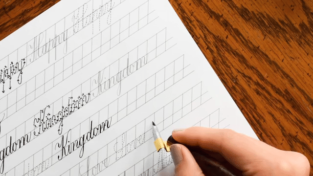
For this tutorial, I chose to create my crayon calligraphy quote in a massive sketchbook. (The pointed pen snags on this particular sketchbook’s cottony pages, so it’s a perfect candidate for crayon calligraphy.) That said, you can create crayon calligraphy on virtually any piece of light-colored paper. So, pull out a sketchbook, a piece of printer paper, or even a standard notebook. Anything works!
This Mahara sketchbook (affiliate link) has big, beautiful pages that are great for crayon calligraphy.
Once you’ve got your paper ready to go, here are the other supplies you’ll need:
Wax crayons in the following colors: yellow orange, red orange, brick red, brown, yellow (affiliate link)
Orange colored pencil (I used a Prismacolor PC918, available in this set) – optional but recommended
2. Use Faux Calligraphy to Write a Short Quote
Now, use your yellow-orange crayon to write a short quote in script. Be sure to make expansive letters so you can draw in downstrokes later. Don’t bother with pencil guidelines; this is loose, just-for-fun writing!
We’re not using pencil guidelines today. Just go with wherever your hand takes you!
Use your sharpener to customize the tip of your crayon as you go. The more you write, the more blunt the crayon will become.
If the piece looks a little sparse, use some flourishes to flesh it out. Give them some faux calligraphy downstrokes as well.
Finish up this step by coloring in all of your downstrokes with that same yellow-orange crayon. Go over upstrokes, too, to make them more opaque and robust.
This step took a lot out of my crayon! Look at how short it is now.
3. Make it Ombré
Now, grab your red-orange crayon. Use it to draw directly over the calligraphy you just created with the yellow-orange crayon, working your way about 75% up every letter or flourish. The goal is for the top of each letter to have a tidy amount of yellow-orange on top. If the colors don’t blend nicely where the red-orange ends, don’t fret; we’ll address that later.
As you color, you’ll notice that this step is pretty smooth. A toothy paper surface eats a crayon quickly (like my nub of a yellow-orange crayon from the previous step); but drawing directly over wax crayon is pretty easy.
You’ll find that coloring over existing crayon is smooth and enjoyable. (Don’t be intimidated by the tiny crayon pictured here; mine broke in half from the warmth of my hand and an overzealous grip.)
Now, use your brick red crayon to draw directly over the letters. Stop about halfway up, such that the bottom half of each letter or stroke is red.
For letters like “p”, “y”, and “g”, you’ll make all of the descender red.
Next, use your brown crayon to draw over the bottom 25%(-ish) of every stroke.
Exercise good judgment here, and be flexible depending on what will add balance to the piece. Notice, for example, that I used brown in two places on the “g”. The first brown occurs in the descender, and the second is in the flourish above the word.
4. Blend and Smooth
Remember how I said not to worry about abrupt color transitions? That’s because in this step, you’re going to use your yellow crayon to draw over every single stroke. Its lighter pigment blends and unifies, softening the transitions.
Once you’ve used your yellow on the strokes, you can use an orange colored pencil to smooth out stroke edges. This is an optional step that arguably makes this “crayon/colored pencil calligraphy”, but it goes a long way in making the quote look cleaner.
Once you’re finished, step back and admire your work! Then, if you need a couple more flourishes here and there, feel free to add them in. It’s all about making a colorful, expressive piece that speaks to you.
I sprinkled in a couple of additional flourishes to give the composition a fuller look.
Tips
As you create, remember that this project is more about play than perfection. The gentle repetition and color blending make for a calming, almost meditative experience—with a cool finished piece as the bonus reward. Here are some tips to help you get the most out of it:
A drafting brush (affiliate link) is an excellent choice for clearing off excess wax. If you use your hand, the warmth can actually press pigment into the paper where you don’t want it.
I used a warm, autumn-like color scheme for this tutorial. Feel free to deviate from that to mix it up! The formula is this: start with a medium-light tone. Then, use a medium-dark tone, a dark tone, and a very dark tone for the ombré effect. Finish up by drawing over everything with a light tone. (Another good color scheme would be semi-light blue, dark blue, dark purple, black, and light blue.)
Don’t judge your lettering harshly. The point is to have fun! You can always use flourishes to distract the eye from wonky slants or less-than-optimal word placement.
This crayon calligraphy tutorial is as much about enjoying yourself as it is about learning. You can think of it as low-stakes practice with high-reward results. If you’re taking the Beginner’s Modern Calligraphy Online Course, consider it bonus homework that feels more like play. And even if you’re not, it’s still an excellent way to sharpen your eye and loosen your hand! Have fun, and don’t hesitate to post your crayon calligraphy adventures on the TPK Discord. I’m excited to see your quotes and color schemes. 🙂
To provide the best experiences, we use technologies like cookies to store and/or access device information. Consenting to these technologies will allow us to process data such as browsing behavior or unique IDs on this site. Not consenting or withdrawing consent, may adversely affect certain features and functions.
Functional
Always active
The technical storage or access is strictly necessary for the legitimate purpose of enabling the use of a specific service explicitly requested by the subscriber or user, or for the sole purpose of carrying out the transmission of a communication over an electronic communications network.
Preferences
The technical storage or access is necessary for the legitimate purpose of storing preferences that are not requested by the subscriber or user.
Statistics
The technical storage or access that is used exclusively for statistical purposes.The technical storage or access that is used exclusively for anonymous statistical purposes. Without a subpoena, voluntary compliance on the part of your Internet Service Provider, or additional records from a third party, information stored or retrieved for this purpose alone cannot usually be used to identify you.
Marketing
The technical storage or access is required to create user profiles to send advertising, or to track the user on a website or across several websites for similar marketing purposes.
TPK’s innovative newsletters are an artistic treat. Join the 125K+ subscribers who have already discovered The Postman’s Knock, and receive 10% off your first Digital Catalog order.
Unlock Exclusive Perks with Premium Plus
Fuel your inspiration and creativity with TPK Premium Plus! Members enjoy three free worksheets or learning resources every month, unlimited video course access, member-exclusive tutorials, and a 10% discount on all Supplies Shop orders.