Your cart is currently empty!

You Are Already Logged in
Nico Ng is a lettering artist and designer based in Manila, Philippines. He is well-known for his lettering composition style and analog tools, and he is here today to share his process for creating a stunning lettering layout! In addition to quality instructions, this tutorial includes a must-have free printable.

Today, we have a special guest who will share a different approach and his secrets to creating an eye-catching lettering layout. Nico Ng was recently featured — along with TPK — in Calligraphy Crush Magazine. It’s difficult not to drool over his fantastic lettering compositions! In this tutorial, he’ll divulge his process, provide us with a free printable, and show us how to use his innovative composition ruler. Without further ado, I’ll hand over the reins to Nico:
Every artist develops their own technique and process over time. If you were to ask me what my secret to creating lettering is, it is careful planning. You should not rush your work. Instead, plan your lettering to create the best possible outcome, avoid mistakes, and enjoy the process. We have to spend time sketching ideas, making pencil guidelines, and drawing drafts before inking.

Let’s start with the first step, which is to carefully planning your lettering.
The most frustrating mistake you can make is finishing a piece and realizing that you made a spelling error or you’re missing a word. That’s why the first thing you should do is to write down your quote. Then, check the spelling and grammar before moving forward.

Next, circle the keywords in your quote that you want to emphasize in the layout. Drawing your word in different styles and sizes will give you a more interesting lettering composition.
Once you have selected the keywords, try sketching four different layout options. Start with a simple layout with rectangular layout shapes, then sketch more layout options using different layout shape combinations.

Sketch the layout shapes in order to see the shape and form of your final lettering. You can also fill in the words in different lettering styles (sans serif, serif, script) to see how well the lettering styles work together. You only need a quick sketch for this step.

Now, select the layout option that best represents the meaning of the quote you are lettering. Then, start building the layout guides. This step is very important and should not be skipped or rushed. If you skip the layout guides, you will likely end up with a layout that has misaligned words. I know this process can be a bit tedious and difficult to draw perfectly. That’s why I created a composition ruler specifically to make the layout process fun and easy. Let me show you how:

First, center your composition ruler on top of your paper. Then, mark the holes at the top and bottom to set up a layout grid.

Next, connect the top and bottom center dots to draw your center guideline.

Now, begin drawing your layout shapes. I always start with the shape of the main word.


Be sure to draw your shapes in the correct sizes and space them appropriately. If you need to fix the size and spacing, do it now before you start drawing in your words.

While I recommend using a composition ruler for lettering pieces in general, I have a treat for you today. I’ve created pre-drawn printable guidelines for the “Take a Small Step Every Day” quote featured in this tutorial. You can download it here.
DOWNLOAD NICO’S FREE GUIDELINES
Now, draw letter “skeletons” inside your layout shapes. Make sure the first letter touches the left boundary and the last letter touches the right boundary. Also be mindful of spacing the letters properly. This will result in a centered and clean-looking layout.

Next, flesh out your letter skeletons. Try to draw the thicknesses with consistency to achieve a clean and professional look.

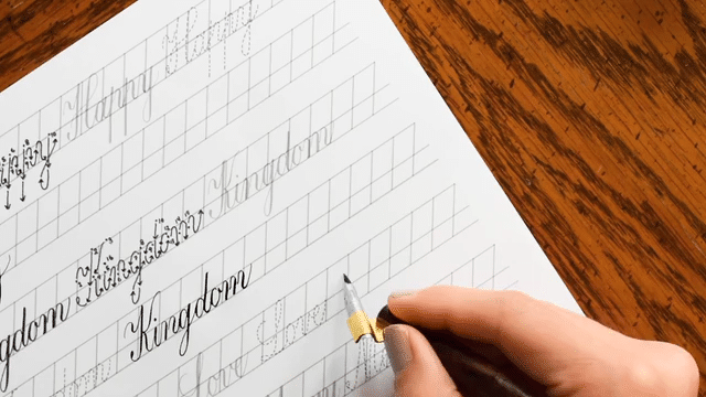
Before you add ink, do one last check to see if there are any mistakes that need correcting. If everything looks good, start inking the outlines of the letters!

Continue to add ink until all the outlines are finished.

Let the ink completely dry, then erase the pencil guidelines. It’s a good idea to erase the guidelines before inking the letters completely to avoid fading the ink during erasing.

Now, fill in your letters with ink!

Continue to fill in the letters with ink until you’re finished.

At this point, your lettering probably looks a bit empty! Don’t worry: it’s time to embellish the letters to make them look more interesting. To do that, try adding a simple line shadow and some inline designs.

There’s one more step to finish your lettering composition! Fill in the empty spaces of your lettering with decorations. My go-to decorations are sparkles, rays, and leaf illustrations. I also love drawing in some gold leaves.

That’s it for today! I hope that you learned something new from my tutorial.

Now, it’s your turn to create a dynamic lettering composition! Just pick a quote, follow this step-by-step tutorial, and enjoy creating! For feedback on your work, tag me on Instagram at @nicong.co so I can see your lovely lettering compositions!
Best,

P.S. – You can start creating better lettering layouts easily with my composition rulers. You can purchase the composition ruler bundle from the TPK Supplies Shop here.
Fuel your inspiration and creativity with TPK Premium Plus! Members enjoy three free worksheets or learning resources every month, unlimited video course access, member-exclusive tutorials, and a 10% discount on all Supplies Shop orders.

inspiration in your inbox
TPK’s innovative newsletters are an artistic treat. Join the 125K+ subscribers who have already discovered The Postman’s Knock, and receive 10% off your first Digital Catalog order.