In this simple tutorial, I’ll show you how to use white ink and colored pencils to create a phrase that really pops! Black cardstock especially loves “colored pencil calligraphy”, but you could tailor this concept for any paper color.
Today’s colored pencil calligraphy tutorial is one of those projects that you should save for a day when you need some quiet and reflection. It’s something that requires a bit of time, but not intense focus — so you can let your thoughts wander as you color! To begin, you’ll need a white pencil, a black piece of cardstock, a dip pen + white ink, and colored pencils.
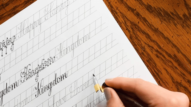
1. Write Out a Phrase in Calligraphy
You’ll begin by using your white mechanical pencil to write out a draft of any short phrase that you connect with. (For more information about making layouts like the one below, you can visit the How to Make Calligraphy Quote Art tutorial.) Feel free to create your phrase in any calligraphy style! I chose to use the Kaitlin because it has a lot of nice contours.
I cut the cardstock that I’m using here to 8″ x 10″ (203 mm x 254 mm), then I drew a 1.5″ (38 mm) border around it to keep my calligraphy contained.
Next, trace over your calligraphy with a dip pen and white ink.
Try to use a flexible nib that doesn’t make hairline-thin upstrokes. Otherwise, your lettering may end up looking too delicate and it won’t stand out in the final project.
Allow your ink to dry (give it 15 minutes just to be safe), then move on to the next step!
2. Add + Blend Colored Pencils
You can use any color scheme you want for colored pencil calligraphy. I’d recommend choosing three colors that you feel go well together. Make sure they’re fairly light because you want them to show up against the dark cardstock!
For my colored pencil calligraphy, I choose a light green, a light purple, and a light blue. (The exact names are Apple Green, Parma Violet, and True Blue, for those who have the Prismacolor Set.)
Now, start using the colors in a random order to fill in the space around your calligraphy. Follow these two rules:
Apply pressure to your pencil in the areas that directly border letters in order to create dramatic color contrast. As you color away from the letter, let up on the pressure to make a lighter tone.
Don’t fill in the counters of letters (meaning: the areas inside of loops, such as the bottom of a “y”and the inside of the “o”, both shown below). Leaving the counters blank will lend some rich visual interest to the finished piece!
Keep a pencil sharpener nearby! You need fine tips to work around the nooks and crannies of letters.
Continue to use your colored pencils to fill in all of the space around your calligraphy. For maximum contrast, extend your colored pencil to the border that you drew in step 1. Don’t worry about where to put which color — the whole point of this tutorial is to go with your gut and let your mind wander! Any spontaneous combination will end up looking great.
You can put a piece of paper under you hand to protect the calligraphy underneath as you work your way down!
3. Erase
Once you’ve finished adding color to your piece, use an eraser to get rid of any visible white guidelines. Exert very gentle pressure; you don’t want to accidentally erase the colored pencil!
Black erasers generally work best to erase marks on black cardstock. If you don’t have one, no big deal! A white eraser will work, too — but it may leave a bit of residue.
When you finish, take a step back to enjoy the artistic effect! This type of colored pencil calligraphy especially looks striking from afar.
Again, this isn’t a complicated tutorial by any means — but sometimes it’s nice to have a project that doesn’t necessarily take a lot of concentration. Put on a good podcast or playlist, keep a yummy snack or drink at hand, and let yourself relax for an hour or so as you delve in to making this project! My guess is that creating it will make you feel rejuvenated and renewed, which is exactly what it did for me. 🙂
If you have any questions, suggestions, or observations, I always enjoy hearing from you in the comments! Otherwise, I hope that you feel inspired by this tutorial, and that you have a wonderful weekend. Thanks so much for reading!
To provide the best experiences, we use technologies like cookies to store and/or access device information. Consenting to these technologies will allow us to process data such as browsing behavior or unique IDs on this site. Not consenting or withdrawing consent, may adversely affect certain features and functions.
Functional
Always active
The technical storage or access is strictly necessary for the legitimate purpose of enabling the use of a specific service explicitly requested by the subscriber or user, or for the sole purpose of carrying out the transmission of a communication over an electronic communications network.
Preferences
The technical storage or access is necessary for the legitimate purpose of storing preferences that are not requested by the subscriber or user.
Statistics
The technical storage or access that is used exclusively for statistical purposes.The technical storage or access that is used exclusively for anonymous statistical purposes. Without a subpoena, voluntary compliance on the part of your Internet Service Provider, or additional records from a third party, information stored or retrieved for this purpose alone cannot usually be used to identify you.
Marketing
The technical storage or access is required to create user profiles to send advertising, or to track the user on a website or across several websites for similar marketing purposes.
TPK’s innovative newsletters are an artistic treat. Join the 125K+ subscribers who have already discovered The Postman’s Knock, and receive 10% off your first Digital Catalog order.
Unlock Exclusive Perks with Premium Plus
Fuel your inspiration and creativity with TPK Premium Plus! Members enjoy three free worksheets or learning resources every month, unlimited video course access, member-exclusive tutorials, and a 10% discount on all Supplies Shop orders.