When I receive modern calligraphy questions in my inbox, sometimes I start to write back and I think, “Wait a minute … I’ll bet there are a lot of other people who have this exact same question.” Today’s blog post was born out of five common queries that I receive, and I hope at least one of the answers will help you! From ink trouble-shooting to thoughts on pricing, there’s a little bit of everything in this post.
1. Shaky Calligraphy
“I’ve been having a lot of trouble with ink drag and not being able to get those really thin upstrokes. My downstrokes are also very blotchy-looking and I can’t seem to get a clean line. Everything is pretty shaky. Does this just come with more practice? Or am I maybe holding the pen wrong?” – Morgan
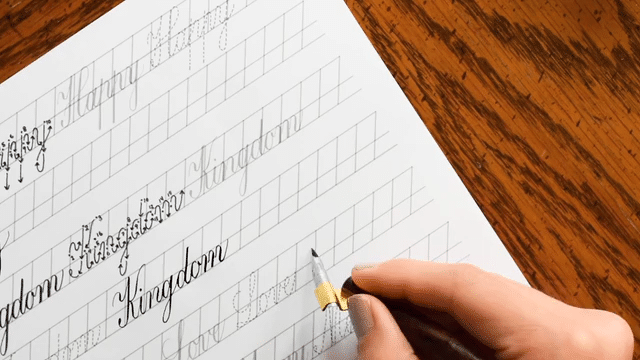
Having shaky calligraphy is a very common problem, especially if you are just beginning! It may seem like a calligraphy pen is equal to the sort of writing instrument you’re used to (ballpoint pen, pencil); but the truth is, navigating a calligraphy pen requires a significant amount of mental re-wiring. You’re thinking about so many things, like keeping both tines evenly on the page, exerting varying pressure on downstrokes/upstrokes, and getting the correct amount of ink on the nib, among other concerns! When you’re taking that much new stuff into consideration, it’s hard to stay cool as a cucumber and have confident hand-movements. Shaky calligraphy is also caused by not having a solid grasp of exactly what the letterforms look like and how to write them; there’s always a little hesitation as you’re writing since you want to make sure you’re “doing it right”. With all that in mind, take a look at this real-life beginner photo taken by my friend Noel as she started her calligraphy journey in May of this year:

Noel’s early attempt shows a lot of promise; it’s clear that she was mindful of varying pressure on her upstrokes and downstrokes. She’s also experimenting with flourishes and trying to keep her letterforms consistent. However, you can see that there’s some shakiness and hesitation. Fast-forward to August, and this is what her calligraphy looks like:

You can see a big difference in the latest photo of Noel’s calligraphy! The big question is: how did Noel accomplish such a dramatic change? She practiced a minimum of 4-5 days per week with a couple of different LCfaL worksheets (the style pictured is Kaitlin); often she didn’t practice long, just 15-20 minutes or so. She explained to me that creating calligraphy provided her with a way to decompress after work, even if she only did it for a few minutes. To sum this answer up, the solution to curing shaky modern calligraphy as a beginner is just to practice.* As you get more confident with your tools and your strokes, you will see results like Noel’s! (Thanks, Noel, for letting me share these photos!)
*Note that if you’re past the beginner level and you are still experiencing shaky calligraphy, the Calligraphy Troubleshooting: Nib Pressure + Shaking Hand post is worth a read.
2. Unpredictable and Frustrating Ink Flow
I’m a left-hander and when I use the straight holder, either too much ink starts bleeding out or no ink will come out at all. [Another issue I’m having is achieving] the thick and thin strokes. It just looks uneven and unnatural. Simply put, it just looks horrible. 🙁 – Ashley
There are a couple of reasons that ink could be giving you grief. The first reason, and the simplest to solve, is you nibs are not primed. Every nib comes with manufacturer’s oil on it, and in a lot of cases you have to get the oil off in order for the ink to flow correctly. It’s easy to do this with an old toothbrush and dish detergent; you can read cleaning instructions in the Lowdown on Calligraphy Nibs post.

If you have primed your nibs and the problem persists, then the issue is more than likely your ink. I know that as a beginner, I often took for granted that ink would be ready to write with straight out of the bottle. However, sometimes this simply isn’t the case! Some inks are too thin, and using them results in blotchy, uneven calligraphy that looks like this:

The solution for thin ink is to add either liquid or powder gum arabic, as described in tip #2 of Seven New Calligraphy Tips. Just keep mixing gum arabic in with the ink until it starts behaving for you!
The opposite problem is dealing with ink that’s too thick:

Thick ink tends to cling to your nib and stay there. Sometimes it works okay on downstrokes, but good luck trying to get it to cooperate with you for an upstroke! Thankfully, thick ink is an easy fix — simply mix in some water (preferably distilled), a couple of drops at a time, until the ink writes well for you.
3. Trouble Achieving Stroke Contrast (Thick Downstrokes, Thin Upstrokes)
“I am having trouble with my strokes. They aren’t really going thick to thin at all. The stroke is staying the same thickness for some reason. I watched your videos and you don’t angle the nib or turn it any way; it’s just held straight the whole time, so that’s what I am doing. Maybe it is the nib I am using? I have a few different ones that I have tried. Any advice on achieving those thick to thin strokes?” – Taylor
First of all, Taylor is correct in saying that the type of nib can really make a difference as far as stroke contrast is concerned. You can see a wide range of variation on the photo below, and these are only four nibs out of many available!:

You may notice that the Nikko G nib, which I suggest in my DIY Modern Calligraphy Starter Kit recommendations post, doesn’t have the capability to produce a lot of stroke variation. That’s because it’s a medium-flex nib, which means the tines aren’t physically able to split far apart in order to give you a super-thick downstroke.

You may wonder why I recommend a nib with so little stroke variation capability. Well, as a beginner, if you’re working with a super-flexible nib, you’re probably going to get really frustrated, really fast. Flexible nibs are delicate by nature, so tines have a tendency to catch on paper and spatter ink. It’s also difficult to regulate your pressure on a flexible nib if you don’t have the “hang” of it yet, which can affect ink flow. That’s why it’s better to learn with the Nikko G, which is a strong nib that will tolerate you experimenting with your pressure exertion.
Mastering pressure exertion comes with practice and finding “the” nib for you, so you shouldn’t feel bad if there’s no difference to speak of between your upstrokes and downstrokes. The important thing to focus on for now is the letter formation, then the slant. After you’ve got both of those things down, then you can focus on pressure.

If you’re still feeling uncertain about the amount of pressure to exert on the nib, read the Calligraphy Troubleshooting: Nib Pressure + Shaking Hand post.
Before I end this answer, I want to say that the whole nib pressure thing can be tough. Trust me, I understand! If you are getting fed up with it, try practicing with a brush pen for a few days or weeks. You can still create cool calligraphed projects with a brush pen (like the Amy Style envelope pictured below), plus you’ll gain an excellent understanding — and muscle memory — of pressure exertion.

To learn a little more about using brush pens to write calligraphy, I recommend reading this blog post.
4. Writing on Less-Than-Ideal Paper Surfaces
“Do you ever come across clients who provide less-than-ideal paper/envelopes?” – Kristin
It’s a simple question, and one that can really stress you out if it happens to you. If you’re getting paid to perform a service, it’s agonizing to realize that you cannot complete the project as you had planned. If for some reason you are in a situation where you must write on certain paper that’s not behaving (e.g. a “bad” envelope), remember that where there’s a will there’s a way! There are a couple of solutions.
A. Use a blunt nib and thick ink.
For fibrous envelopes like the kraft envelope shown below, you won’t want to use a pointy nib like the Brause EF66 or the Nikko G. Instead, the Rose is best-suited to the task! Even with an ideal nib, certain inks won’t work on this envelope; the fibers will cause runnier inks to spread out and spiderweb. For this reason, thicker inks that don’t tend to spread are best-suited for the job. If you must use a certain color and it’s too runny, add gum arabic.

B. Spray the envelope with fixative before you write.
Spraying a fixative on paper that refuses to play nice with the nib or ink can help a lot! The fixative evens out the surface and prevents the ink from interacting with the paper fibers. That means no more ink bleed and a smoother writing experience overall! (For details on this technique, see tip #3 in the Seven New Calligraphy Tips post.)
C. If it’s just not working, be communicative and suggest an alternative.
Most people will understand if the envelopes they have chosen for you to calligraph on isn’t working with any inks, despite the fact that you’ve tried several different things.

If things just aren’t going right, think about your other options. Could you use a different medium as an ink (e.g. gouache) to solve the problem? If so, you’ll want to inform your client that the envelope calligraphy will be somewhat matte. If absolutely no ink will work on the envelopes, perhaps you could write on a rectangle of nice, coordinating paper and glue it on the front of the client’s envelopes? It’s a good idea to brainstorm your options and talk them through with the client to determine what they want to do. One option is always to start fresh with new envelopes; you can read my envelope recommendations under the “Choosing Envelopes” subcategory of the Different Types of Paper blog post.
5. Pricing
“How can I calculate the (right) price of my creations?” – Simone
I wish that I had a specific formula for you, but the truth is this: pricing is extremely subjective. There’s really no one-size-fits-all equation that I can provide to help you out with this one. Not to go all “Disney animated film” on you, but the answer is inside you — look, and you shall find it.

Okay, obviously that advice is cheesy and abstruse, so instead of saying a lot without really saying anything to answer Simone’s question, I heartily recommend that you check out Mayi Carles’ opinion on the matter. Her philosophy on pricing is this: “Ultimately, [the price you ask for] is about creating happiness, not gluttony or deprivation.” In short, charge a price that you are comfortable working for. If you’re feeling resentful as you’re calligraphing because you aren’t being properly compensated, then you know to raise your price for next time. Conversely, if you have a bit of guilt because you think you’ve charged too much, you can lower your price next time. It’s all about striking a balance; and if you have to make a couple of mistakes to hit that balance, that’s perfectly fine!
I hope that today’s blog post helped to clear up at least a couple of questions you may have had! If you have anything to add (either to ask or to advise), please leave a comment. You never know who you’ll be helping with your thoughtful question or suggestion!
Thanks — really, very much — for reading, and have a good weekend!
Warmly,

*This post contains affiliate links to Amazon