Blank space — whether it’s in a sketchbook, on an envelope, or even on your wall, can be scary! How do you fill in that space in an elegant and intentional way? In this article, we’ll cover seven concepts that you can use to add detail and interest to your work.
You can use illustrated tiles to fill in blank space on anything from mail art to walls! In this article, we’ll examine seven different ways to enhance your projects with clever motifs and techniques.
We’ve all created a project at some point that just feels sparse! Whether you’re working on a sketchbook page, an envelope, or even a blank wall, it’s good to know a few artistic ways to fill in space. You can use the ideas in this article to enhance both your paper projects and your home!
1. Add an Illustrated Tile Motif
Illustrated tiles add beauty and visual interest to anything you’re working on! I’ve used it for everything from walls (see my workspace tour) to mail art and sketchbooks.
I even love using illustrated tiles to fill up space on my walls! In the timelapse video below, you can watch me finishing up a tile motif on a piece of furniture that we use as a room divider. I walk by these tiles several times a day, and they catch my eye every single time:
I currently have two illustrated tile tutorials on the TPK site:
When you’ve got a large expanse of blank paper in front of you, you can go back to basics and draw branches and leaves. If you really want to get rowdy, you can add in a few gold dots, too!
If you’re right-handed, try starting your branch motif at the top left of the page and work your way over/down. Lefties should start at the top right. In this way, you’ll avoid smudging your work! (As a side note, the “B” in this spread is from this tutorial.)
“Branches” are easy … they’re just curved lines. Then, leaves are almond shapes that connect to the lines. You can use any writing instrument to make them!
I used a black Muji pen to make these leaves and branches over a series of three evenings. When I was finished, I went through and added dots of Arabic gold watercolor with a paintbrush.
3. Illustrate Roses
When I have a good amount of space to fill up and I want to give my piece a vintage and pretty feel, I draw roses.
It’s important to use waterproof ink — like Ziller — if you want to fill in your rose illustrations with watercolor.
Roses might look intimidating, but they’re easy to draw if you use a template.
When I want to add roses to mail art or sketchbook pages, I normally use a light box to trace over a template. The template provides an effective little shortcut!
I recently wrote a tutorial over how to draw vintage roses yourself. If filling in space with a rose motif appeals to you, you can read that tutorial here.
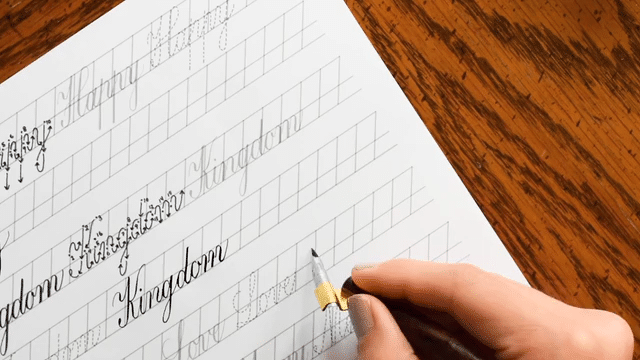
4. Add Miles of Flourishes
If you’re comfortable using a dip pen (or faux calligraphy or a brush pen), consider adding flourishes to your too-bare pieces. Swoops and swirls provide an elegant way to fill up space!
Place cards, envelopes, bookmarks, and general artwork can all benefit from a bit of flourish. When I use flourishes, I tend to go overboard, and I’m never sorry about that!
Besides the intermediate course, there are a few free resources that will teach you how to flourish here on TPK. They include the following articles/printables:
There have been a few occasions where I’ve made a sketchbook page that’s missing something. The white background just isn’t quite right, but adding too much color will throw off the balance of the whole page. In that case, I make (extremely strong) coffee or tea, and I use it to layer on subtle color.
You can learn how to layer on tea or coffee to fill in blank space in this tutorial.
I especially love using my beverage to add spatters to the page. You can enhance the spatters by outlining them in black ink.
If you’re in a rush (and even if you’re not), decoupage is an amazing way to add visual interest to your pieces. Just find a subject or photo that you like, cut it out, and glue it on to whatever you’re working on.
Just a word of warning: if you plan to use decoupage on mail art, be sure to glue down the edges of your artwork very well! Otherwise, postal machines may tear the artwork off of the envelope.
Illustrated wreaths usually look best with some sort of text or calligraphy inside. I usually begin by writing the text/calligraphy, then I center the wreath around whatever I’ve written.
Honestly, I could go on and on with ideas for filling in blank space. In scrolling through the TPK Instagram feed for ideas about what to include in this article, though, I found too many to include here! From drawing lace to making postage stamp collages to adding loose floral illustrations to your pieces, there are so many things you can do to add interest and balance to your pieces.
Here’s what I would recommend: if you’re on Pinterest, start a board where you can “pin” your space filling ideas. Then, next time you’re stumped about how to fill in blank space, reference your board. Chances are an idea will jump right out at you!
If you have any go-tos for filling in blank space, please contribute them in the comments; I always appreciate suggestions and ideas. Thanks so much for reading, and happy creating!
To provide the best experiences, we use technologies like cookies to store and/or access device information. Consenting to these technologies will allow us to process data such as browsing behavior or unique IDs on this site. Not consenting or withdrawing consent, may adversely affect certain features and functions.
Functional
Always active
The technical storage or access is strictly necessary for the legitimate purpose of enabling the use of a specific service explicitly requested by the subscriber or user, or for the sole purpose of carrying out the transmission of a communication over an electronic communications network.
Preferences
The technical storage or access is necessary for the legitimate purpose of storing preferences that are not requested by the subscriber or user.
Statistics
The technical storage or access that is used exclusively for statistical purposes.The technical storage or access that is used exclusively for anonymous statistical purposes. Without a subpoena, voluntary compliance on the part of your Internet Service Provider, or additional records from a third party, information stored or retrieved for this purpose alone cannot usually be used to identify you.
Marketing
The technical storage or access is required to create user profiles to send advertising, or to track the user on a website or across several websites for similar marketing purposes.
TPK’s innovative newsletters are an artistic treat. Join the 125K+ subscribers who have already discovered The Postman’s Knock, and receive 10% off your first Digital Catalog order.
Unlock Exclusive Perks with Premium Plus
Fuel your inspiration and creativity with TPK Premium Plus! Members enjoy three free worksheets or learning resources every month, unlimited video course access, member-exclusive tutorials, and a 10% discount on all Supplies Shop orders.