The secret to creating gorgeous calligraphy? Good calligraphy guidelines! In this post, you’ll learn about what calligraphy guidelines are and how to make them.
Calligraphy guidelines are the behind-the-scenes stars of most great pieces. Since guidelines don’t show up in finished works, though, we don’t talk about them a whole lot. Today’s blog post will change that! Instead of letting guidelines remain a murky background detail, we’ll examine what they are, how to make them, and shortcuts for using them.
What are Calligraphy Guidelines?
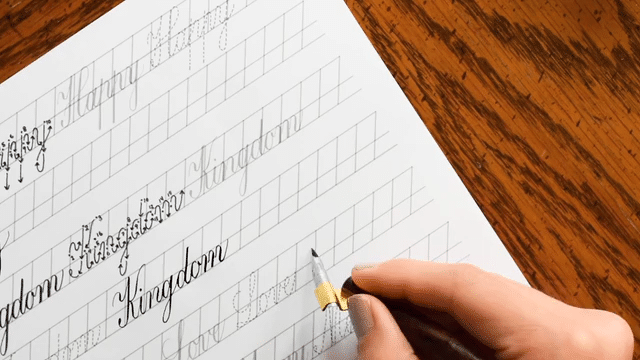
Calligraphy guidelines help you to know exactly where and how tall to make your letters. Guidelines are usually drawn with a graphite pencil (on light-colored papers) or a white pencil (on dark-colored papers). Once you have used the guidelines to write your calligraphy and the ink has dried, you erase the guidelines.
The Fons & Porter white mechanical pencil works wonders on dark paper! Despite its opacity, it erases off very well.
How to Make Calligraphy Guidelines
There are a few steps to making calligraphy guidelines. They are:
1. Decide Your Lowercase Height to Uppercase Height Ratio
For more formal calligraphy styles (such as Janet and Flourish Formal), you want a uniform height for all of your letters. That means you’ll need three guidelines: a base guideline, a middle guideline (to denote the height of lowercase letters), and a top guideline (to denote the height of uppercase letters).
This Janet Style calligraphy features lowercase letters that are about 40% the size of the uppercase letters.
For larger text, I generally create a middle guideline that is a little bit closer to the bottom guideline than it is to the top guideline. That makes my lowercase letters about 40% the size of my uppercase letters. For smaller text, I position the middle guideline in the center of the top and bottom guidelines. Note that the ratio of lowercase letters to uppercase letters is based on personal preference. I encourage you to play around with guideline heights to see what you like best!
2. Assess the Space You Have
Once you figure out how many guidelines you need, you’ll want to look at your project and decide how far to space the guidelines apart. If you have a lot to write but not very much space, then you need to draw guidelines that are spaced very close together.
The guidelines for this Kaitlin Style envelope are spaced close together to fit a long address in a small space! (You can learn how to draw the spider in the newly-released Garden Drills packet.)
If you have a lot of space at your disposal, you can draw guidelines that are farther apart. It all depends on how big you want your letters to be!
3. Use a Ruler to Draw Evenly-Spaced Guidelines
Once you have decided how far apart your guidelines need to be, you’ll also need to assess how many sets of guidelines to draw. In the case of most envelopes, three sets are perfect. Use a ruler to draw three sets of evenly-spaced guidelines, and make sure that you maintain a consistent distance between each set.
There is about 1/4″ (6.35 mm) of space between these three groups of calligraphy guidelines.
A parallel glider makes it easier to create parallel guidelines. If you find yourself drawing a lot of calligraphy guidelines, an investment in such a ruler would be justified!
4. Write and Erase
Once you’ve written on the guidelines, allow your ink to completely dry, then erase the guidelines. Try to use a white eraser (such as Staedtler Mars) for light-colored papers, and a black eraser for darker papers.
Sometimes you’ll notice white residue if you use a light-colored eraser to get rid of guidelines on dark-colored paper. You can avoid that problem by using a black eraser.
How to Make Your Life Easier (When it Comes to Calligraphy Guidelines!)
There are two major shortcuts when it comes to calligraphy guidelines. The first, and most preferable, is to use a light box. You can make a guideline template like the one shown below, slip it into an envelope, and shine light up through it. A light box will save you a ton of time because you no longer have to draw or erase guidelines!
If you use a light box, you can include additional guidelines to help you achieve a consistent slant.
Unfortunately, if you working with a dark piece of paper or envelope, a light box won’t shine through. In that case, I would make an envelope template on a piece of printer paper (or download one from the TPK site). The envelope template should have a series of evenly-spaced lines that run longer than your envelope.
To use the template, you’ll align your ruler with two of the lines that peek out from either side of the envelope. Then, take a pencil and use it to draw a line along the edge of the ruler. Repeat that step for each guideline on the template.
Variations
First of all, you don’t have to draw three guidelines. If you want to use casual calligraphy (like Kaitlin Style), you can get away with drawing one guideline. Casual calligraphy styles with a bounce don’t require letter height consistency, so you don’t need middle or top guidelines.
Casual and bouncy calligraphy styles like Kaitlin Style, shown here, only need one guideline.
You can also free-hand draw wavy guidelines to make unique calligraphy pieces. The guidelines don’t need to be perfect (and they probably won’t be)! The wavy calligraphy will distract anyone from noticing that the letters aren’t a consistent height.
The guidelines here were hand-drawn, so they’re not perfect.The wavy nature of this Janet Style calligraphy distracts the eye from the fact that the letters aren’t all a consistent height.
I know that calligraphy guidelines aren’t necessarily glamorous, but they’re an integral part of creating calligraphy. The symmetry and harmony that they contribute to the final product is worth going to the trouble of making them! If you have any questions or tips about making calligraphy guidelines, I’d be glad to hear them in the comments. Thanks very much for reading TPK, and enjoy the rest of your day!
To provide the best experiences, we use technologies like cookies to store and/or access device information. Consenting to these technologies will allow us to process data such as browsing behavior or unique IDs on this site. Not consenting or withdrawing consent, may adversely affect certain features and functions.
Functional
Always active
The technical storage or access is strictly necessary for the legitimate purpose of enabling the use of a specific service explicitly requested by the subscriber or user, or for the sole purpose of carrying out the transmission of a communication over an electronic communications network.
Preferences
The technical storage or access is necessary for the legitimate purpose of storing preferences that are not requested by the subscriber or user.
Statistics
The technical storage or access that is used exclusively for statistical purposes.The technical storage or access that is used exclusively for anonymous statistical purposes. Without a subpoena, voluntary compliance on the part of your Internet Service Provider, or additional records from a third party, information stored or retrieved for this purpose alone cannot usually be used to identify you.
Marketing
The technical storage or access is required to create user profiles to send advertising, or to track the user on a website or across several websites for similar marketing purposes.
Fuel your inspiration and creativity with TPK Premium Plus! Members enjoy three free worksheets or learning resources every month, unlimited video course access, member-exclusive tutorials, and a 10% discount on all Supplies Shop orders.
TPK’s innovative newsletters are an artistic treat. Join the 125K+ subscribers who have already discovered The Postman’s Knock, and receive 10% off your first Digital Catalog order.