Nico Ng has not scrimped on any details in this fantastic intertwined script and block lettering tutorial! Today, he’ll walk you through how to make a detailed block lettering pencil draft. Tomorrow, you’ll learn how to apply that draft in order to make an eye-catching gold and white piece on black cardstock in Part II.
Welcome to Part I of Nico Ng’s Intertwined Script and Block Lettering Tutorial!
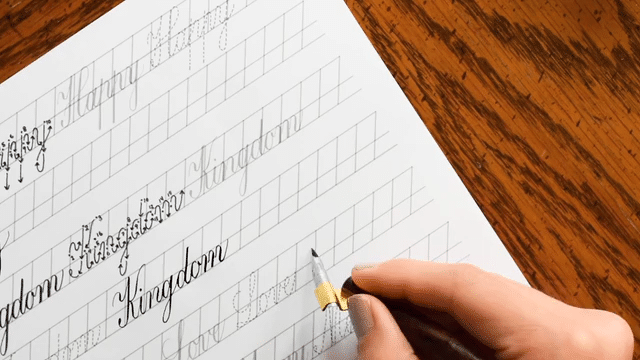
Hi everyone! I’m lettering artist Nico Ng, and it’s time to get creative with another hand-lettering tutorial (you can check out my other TPK tutorials here). In this Intertwined Script and Block Lettering Tutorial, I’m excited to show you one of my favorite techniques: combining script and block letters. It’s a fun challenge to bring these two styles together in a way that’s beautiful and legible. This tutorial has two parts. In the first, I’ll show you how to draw a pencil lettering draft. In the second, which will launch tomorrow, I’ll show you how to use your draft in order to make a final, impressive piece.
Today, I’ll walk you through how to make block letters in a draft format. In Part II, we’ll talk about how to use your draft to make a fabulous piece with intertwined lettering!
1. Gather Your Supplies
For this part of the tutorial, you’ll only need a pencil + eraser and a grid/letter ruler (optional but highly recommended). Note that I’ve also created a free 15-page downloadable PDF to make your life easier! You can use it to write the phrase in this block lettering tutorial and any other phrase, as well.
For today’s project, we will use the phrase “You are loved”. Since “loved” is the most important word, let’s make it stand out by using block letters in a tall, monoweight style. To balance the design, we will write “you are” in a lovely script style.
Quickly writing out your phrase first will help you to determine what word should have the most weight.
The trick is to make the block letters tall enough so that the script letters do not affect their legibility.
Drawing Block Letters (A Detailed Block Lettering Tutorial)
If you’re new to block lettering, it’s a good idea to take things slow by sketching out your block letters on a separate piece of paper first. This way, you can make sure your design looks great, and you can make any necessary adjustments before moving onto the final paper. That sketch/draft is what we are going to focus on in part I of this tutorial. I suggest drawing all your block letters in 4 x 11 unit boxes. (One unit = one dot on the ruler.) To keep the thickness consistent, it’s helpful to use of the grid/letter rulers from the Grid Ruler Bundle. If you’re working with wider or narrower letters, feel free to adjust the size of the boxes accordingly.
1. The Letter L
You’ll start with the first letter, “L”. Use the Edge Measurement Guide of your grid/letter ruler to quickly draw the stem and leg of the letter in the same thickness. Align the guide on the left edge of the box and draw a line, then align the guide on the base of the box and draw another line. At this point, it’s a good idea to download my free printable. It will help you to draw any block letter, including those shown in this tutorial!
First, align the guide on the left edge of the box and draw a line.Then, align the guide on the base of the box and draw another line.Now, you’ve got a perfect “L”!
2. The Letter “O”
Next, let’s move onto the letter “O”. Draw another 4 unit x 11 unit box next to the letter “L”, and allow 2 units’ worth of space between the letter boxes.
In this photo, I’m drawing a guide dot two dots away from the “L”.
Now, find the circle pair with a 4 dot diameter. Align the top circle to the top of your box, then draw the inner and outer circles.
Align the circles with the top of your box, then draw the top and bottom circles.
Use the same circular guide to draw the bottom curve.
Turn your letter ruler upside down, then use the same process to draw the bottom part of the “O”.
Now, use the Edge Measurement Guide to draw the left and right parts of the letter “O”.
Pro tip: when drawing sharp or curved parts of the letter, try to overshoot it a little bit so the letter appears to be the same height as the letters beside it.
Draw your curves slightly over the top and bottom boundaries.
3. The Letter “V”
Next, let’s move onto the letter “V”. Draw another 4 unit x 11 unit box that’s two units to the right of the letter “O”. Then, draw a vertical centerline to use as a guide when drawing the vertex (the bottom, angular part) of the “V”. Use the Grid to dot the points for your diagonal lines and then use the Edge Measurement Guide to draw the letter “V” in a consistent thickness. Be sure to overshoot the bottom part of the letter “V” since it’s a sharp element.
You’ll want to overshoot the bottom part of the letter “V” since it’s a sharp element.Use the Edge Measurement Guide to draw the letter “V” in a consistent thickness.
4. The Letter “E”
For the letter “E”, draw another 4 unit x 11 unit box two units to the right of the “V”. Then, use the Grid to plot the corners of the stem, arm, bar, and leg of the letter “E” (the vertical and horizontal bars of the letter “E”).
Use dots to plan out your letter “E”.Now, connect the dots to make a letter “E”.
5. The Letter “D”
For the last letter, “D”, draw another box of the same size and use the Circular Template to draw the curved corners on the upper and right side of the box, then complete your letter “D”.
For the letter “D”, you’ll draw half circles on the right side of your box.Connect these strokes, and you’ve got a “D”!
6. Assess Your Spacing
Now, take a step back and look at your letters to see if there are any adjustments you need to make. Even though we spaced out the letters equally with 2 units, the lettering may look uneven. That’s because some letters create more white space between them, making the letters look more distant from each other.
It’s clear that we need to change the spacing between “L” & “O” to one unit (a.k.a. dot). Those letters look far apart! “E” and “D” need to be a bit closer, too. Let’s draw them 1.5 units apart.
As you draw more and more block letters, you’ll start to recognize letter pairs that need to be closer or further apart. This means that you might be able to skip making drafts. But, for your first few compositions, it’s a good idea to make a pencil draft first, as I have done here!
To provide the best experiences, we use technologies like cookies to store and/or access device information. Consenting to these technologies will allow us to process data such as browsing behavior or unique IDs on this site. Not consenting or withdrawing consent, may adversely affect certain features and functions.
Functional
Always active
The technical storage or access is strictly necessary for the legitimate purpose of enabling the use of a specific service explicitly requested by the subscriber or user, or for the sole purpose of carrying out the transmission of a communication over an electronic communications network.
Preferences
The technical storage or access is necessary for the legitimate purpose of storing preferences that are not requested by the subscriber or user.
Statistics
The technical storage or access that is used exclusively for statistical purposes.The technical storage or access that is used exclusively for anonymous statistical purposes. Without a subpoena, voluntary compliance on the part of your Internet Service Provider, or additional records from a third party, information stored or retrieved for this purpose alone cannot usually be used to identify you.
Marketing
The technical storage or access is required to create user profiles to send advertising, or to track the user on a website or across several websites for similar marketing purposes.
TPK’s innovative newsletters are an artistic treat. Join the 125K+ subscribers who have already discovered The Postman’s Knock, and receive 10% off your first Digital Catalog order.
Unlock Exclusive Perks with Premium Plus
Fuel your inspiration and creativity with TPK Premium Plus! Members enjoy three free worksheets or learning resources every month, unlimited video course access, member-exclusive tutorials, and a 10% discount on all Supplies Shop orders.