Today, you’ll learn how to craft exquisite monogram art using a free printable from a timeless Victorian alphabet. This tutorial will guide you through every step to create a personalized masterpiece with gold accents and elegant calligraphy.
A decade ago, a thoughtful blog reader gifted me Alexander Nesbitt’s Decorative Alphabets and Initials. At first glance, the book seemed unassuming, but it didn’t take long for me to realize how much inspiration was packed into its pages! Every time I flip through it, I discover another letter to marvel over. Today’s tutorial is inspired by the “Initial Letters” alphabet by D.T. Ames, found on Plate 100 of Nesbitt’s book.
Thanks to Nesbitt’s generosity in making these designs royalty-free, I can share the complete gorgeous alphabet with you for the tutorial! Below, I’ll guide you through the steps to create exquisite monogram art that features calligraphy and unique flourishes.
1. Gather Your Supplies
To bring this project to life, you’ll need the following supplies. Feel free to make substitutions based on what you have available—some of the most creative and unique results come from improvising with materials!
Start by choosing the darkest room in your house with a suitable writing surface. The low light will help your light box shine through the thick, handmade cotton paper more effectively. Once you’re set up, grab your Nikko G nib, a straight pen, and black waterproof ink. Then, lay the initial letter of your choice on top of the light box. Put the cotton paper on top of that letter, being careful to orient the letter more toward the top of the paper. Then, carefully trace the letter with your pen and ink.
Go slow and steady. If the idea of using a pointed pen right away feels intimidating, don’t hesitate to use a pencil first to trace the letter. Once you’re satisfied, you can trace over the pencil lines with your pen in a well-lit environment. Skipping the pencil draft saves time, but starting with it can make the process less stressful!
Work slowly and rotate the papers as needed to give yourself the best writing angle.
Once you finish, your letter should look something like the one below. Note that many—but not all—of the letters in the Ames alphabet have a shaded component with closely-spaced short lines. If you chose a letter with that component, consider making simple pencil guidelines to denote where that shading should go.
3. Add Shading and Contrast
Now, situate yourself in a well-lit workspace. Keeping your letter template on hand as a reference, use your pointed pen to fill in any remaining details like fine line work.
Then, use your paintbrush to add ink to larger areas that require solid shading. Some spaces might be too tight for the brush; if that’s the case, use your pen to fill in those areas.
Once you’re finished, the letter will look something like the one below.
Don’t fill in the shapes in the embellishments with shading lines or black ink! You’ll be adding gold to those in the next step.
4. Add Gold
Now, use the paintbrush to load gold watercolor onto the back of your nib (if you’re not sure how to do that, see this tutorial). Use your nib to draw the gold inside the tight spaces of the letter and the embellishments. Basically, use the nib to apply gold to any space that’s too delicate for your paintbrush.
Once you’ve drawn inside all of the tight spaces, use your paintbrush to fill in the rest.
Since a paintbrush can cover a much larger area than a nib, switching to a paintbrush when you can saves time.
By the time you’re done, about half of the letter and every open embellishment will shine with a stunning, opaque gold finish.
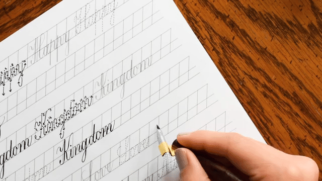
5. Design Calligraphy and Flourishes
Now, use the calligraphy style of your choice to write your recipient’s name in the bottom third of the paper. Be sure to add plenty of flourishes coming off of the letters, and embellish those flourishes with shapes like those found in the design of the Victorian-style monogram above the calligraphy.
Then, use your pencil to add freestyle flourishes to the top part of the page. Don’t be afraid to erase any flourishes that aren’t quite working for you! The best flourishes are often those that required the most experimentation.
Remember to use a light touch as you draft your flourishes. You never know what you might have to erase, and you don’t want to leave a pressure impression in the paper.
Once you’re happy with your flourishes’ placement, go over everything with black ink. When I’m working on handmade paper, I find it easiest to use a Brause Rose nib in an oblique pen to do that, but use whatever pen/nib combination is best for you! When the ink has dried, use your Nikko G nib to fill in the embellishments with gold.
Work slowly! Since this is the last step of the project, it can be tempting to rush through it. However, an ink smudge when you’ve come this far is devastating! So, take your time and rotate the paper as needed to achieve the best writing angle and to protect what you’ve already written.
6. Erase Any Pencil Guidelines
When you’re absolutely certain that all of your ink and watercolor has dried, gently erase any remaining pencil guidelines. Then, step back to appreciate your hard work!
This project was such a joy to make because it’s destined for a childhood friend who’s never received mail from me before. She’s the kind of person who will treasure it forever, and imagining her delight and surprise when she opens it kept me feeling motivated and a bit giddy. So, think of someone special who would love to see their name beautifully brought to life—and make it for them!
I hope you enjoyed today’s tutorial! Feel free to tweak it to suit your style and the supplies you already have. For instance, if you don’t have deckled edge cotton paper, watercolor paper works beautifully. Or, if tracing directly with your pointed pen feels daunting, start with pencil instead. The key is to adapt the project so it’s fun, accessible, and just the right level of challenge for you.
To provide the best experiences, we use technologies like cookies to store and/or access device information. Consenting to these technologies will allow us to process data such as browsing behavior or unique IDs on this site. Not consenting or withdrawing consent, may adversely affect certain features and functions.
Functional
Always active
The technical storage or access is strictly necessary for the legitimate purpose of enabling the use of a specific service explicitly requested by the subscriber or user, or for the sole purpose of carrying out the transmission of a communication over an electronic communications network.
Preferences
The technical storage or access is necessary for the legitimate purpose of storing preferences that are not requested by the subscriber or user.
Statistics
The technical storage or access that is used exclusively for statistical purposes.The technical storage or access that is used exclusively for anonymous statistical purposes. Without a subpoena, voluntary compliance on the part of your Internet Service Provider, or additional records from a third party, information stored or retrieved for this purpose alone cannot usually be used to identify you.
Marketing
The technical storage or access is required to create user profiles to send advertising, or to track the user on a website or across several websites for similar marketing purposes.
TPK’s innovative newsletters are an artistic treat. Join the 125K+ subscribers who have already discovered The Postman’s Knock, and receive 10% off your first Digital Catalog order.
Unlock Exclusive Perks with Premium Plus
Fuel your inspiration and creativity with TPK Premium Plus! Members enjoy three free worksheets or learning resources every month, unlimited video course access, member-exclusive tutorials, and a 10% discount on all Supplies Shop orders.