There are few family heirlooms better than vintage photographs. Vintage photos have a hauntingly sweet beauty that deserves to be shown; yet, if you’re anything like me, some of your best vintage photos may be tucked away in a box somewhere. For today’s blog post, I resolved to develop a vintage photo project that would showcase old family photos and get them into the light of day. After giving the topic some serious thought, inspiration struck: embellished postcards!

For this project, you’ll need access to a scanner, card stock {preferably 110 lb. — it will say on the package}, and a printer that is capable of handling card stock.
First, you’ll scan all your vintage photos in to your computer and re-size them to 4.25″ x 6″ {~10.8 cm x 15.25 cm}. This is the {US} standard postcard size. You can use any program that allows photo editing, like Microsoft Word, Photoshop, Pages, Gimp … whatever. If you need to crop any parts of your photos, that’s perfectly fine. I make templates that allow two photos per page in Photoshop, then I print them off at FedEx/Kinkos using the self-service printers. I go to FedEx because my printer at home cannot handle heavy card stock, but yours may be able to. {You can also have your photos professionally printed; ask the printer for card stock that is 100 lb. cover or heavier. If you’re confused by all this talk of paper weight, visit this page.}

Once you’ve printed out your templates, cut out the postcards.

For my first postcard, which is a precious photo of Hernán’s mom when she was a little girl, I decided to go with a paisley print. I used a Sakura Gellyroll white pen. This is a great option if you aren’t comfortable using a calligraphy pen and white ink, or if you just don’t want to get out all your calligraphy supplies.

If you do opt to use the white Gelly Roll on printed card stock, you’ll need to go over each stroke a couple of times since the printed surface isn’t super-porous. Also note that if you need a pattern reference, you can simply use Google image search to find “paisley pattern”. Then, draw something that is inspired by what you see!

I built up my paisley pattern around Hernán’s mother, taking care not to obscure any of her features. The result was a postcard that really pops! Here is a GIF showing how I executed the design:

In the case of this photo, the paisley highlighted the joy in Hernán’s mother’s face. Using a paisley pattern in this way will enhance the mood of any photo, though! A henna pattern would also look gorgeous.

For the next vintage photo postcard, I took a simpler approach. This photo is of my paternal grandfather, who always sang “Put your shoes on, Lucy, don’t you know you’re in the city? Put your shoes on, Lucy, you’re a big girl now!” Since it was more or less his anthem, I thought it would be an appropriate phrase to letter on the postcard created from his photo.

For this postcard, I used a dip pen fitted with a Blue Pumpkin nib. The white ink I used is more like paint; it’s Winsor and Newton. Because of its nice viscosity, it went on the printed card stock without much of a hitch! However, you could absolutely stick to your white Gelly Roll pen for this concept {you’ll just use faux calligraphy}.

First, I drew “LUCY”, since that’s the word I wanted to stand out. I used Roman style from Learn Hand Lettering for a Latté.

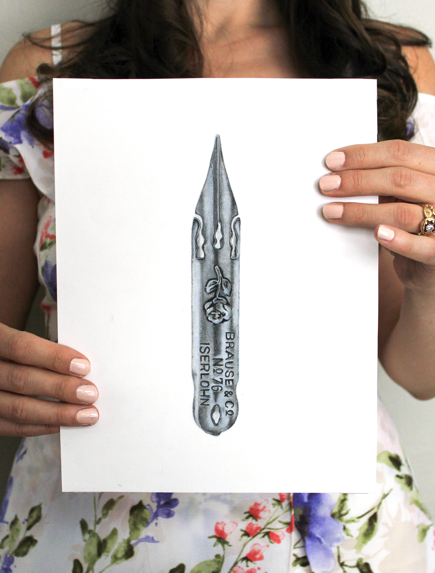
Next, I created calligraphy under “LUCY”. While I had words I wanted to write above “LUCY”, the text wasn’t dry yet, so I decided to tackle the words underneath. I wrote “don’t you know you’re in the” using a Brause EF66 nib; then I used the Brause Rose nib to write “city”. Because the Rose has a bit of a broader stroke, it made “city” stand out more than the other words.

Once everything was dry, I added “put your shoes on,”. Since all the calligraphy was written using Kaitlin style calligraphy, no guidelines were required, and this postcard took just a couple of minutes to make! You could use a similar concept for relatives who were known to have a signature phrase or a song they loved.

The next postcard concept is also very simple: use calligraphy to label the vintage photo. This is a charming portrait of my paternal grandmother’s family.

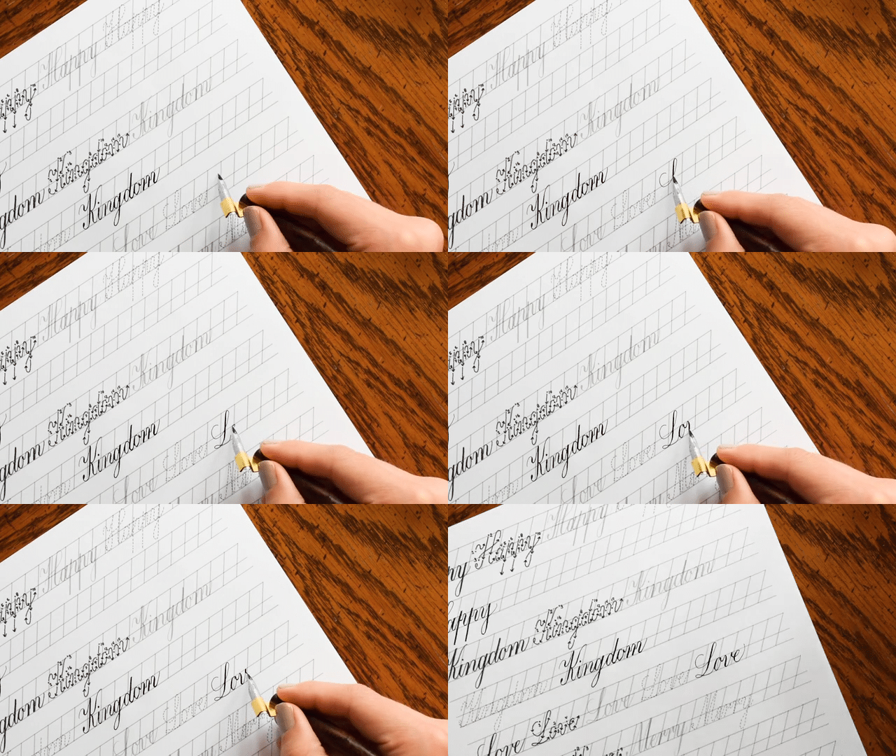
I pulled out my Brause EF66 nib and white ink again to write the names of the people in the photograph. The calligraphy style I used is the Janet.

I also used the guide sheet from Amazing Envelopes for a Latté to create my guidelines; I simply put the photo at an angle to achieve the diagonal I wanted. It’s fine to draw pencil guidelines on your postcard printouts because they will erase out just fine!

While the idea behind this variation of the vintage photo postcards project is simple, the finished piece looks classy and beautiful. It also explains exactly who is in the photo!

The last variation of the postcards is vintage roses. It was inspired by this design in my newly-opened Society 6 shop. This is my favorite concept … and I am actually hesitant to even use this design as a postcard because I want to frame it and keep it.

You are welcome to mimic my vintage roses for your personal postcards by referencing my design on Society 6. To draw the roses, I used sumi ink and a Nikko G nib. However: you could use a very fine-tipped permanent marker {provided you give the ink time to dry!}.

Here’s a GIF that shows how the illustration unfolded. {For some reason, the digital version of the photo is much more yellow than the printed version!}

Vintage roses enhance the demure beauty already present in the portrait. The roses are great to add in if you have a lot of negative space, like I did in this photo!

You may be wondering how to send these as postcards. Simplest thing in the world! Just turn them over, and draw a straight vertical line on the right, like so:

And, boom, you’ve got the coolest postcard known to man! I hope you enjoyed this vintage photo project — and I’d love to hear of other project ideas you have for vintage photos. You’ll be surprised at how much fun you have working with your old family pictures, and if you’re able to do the project with a loved one, great conversations will be sparked about the subjects of the photos.
If you don’t have any old photos, you can always take a new one and add a sepia or black and white effect to it … I won’t tell anyone it’s not authentic if you don’t!
Thanks again for reading The Postman’s Knock blog. It’s amazing to have you here! If you missed the last TPK blog post, check it out to enter for a chance to win an artisan-made calligraphy pen from Rodger’s Pen Box; who knows, you may get lucky!
Warmly,

*This post contains affiliate links to Amazon


