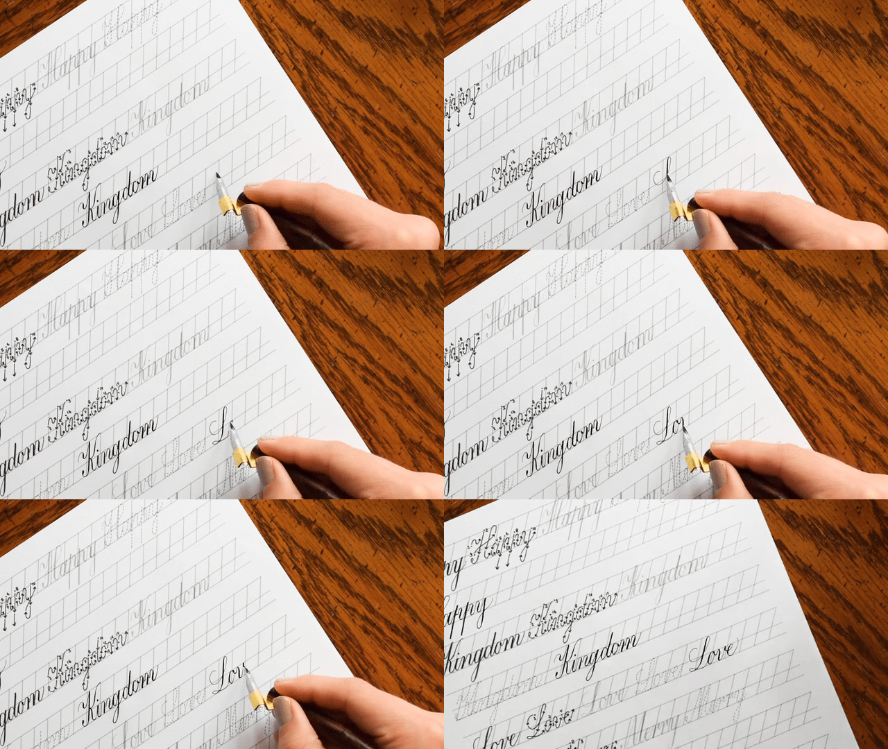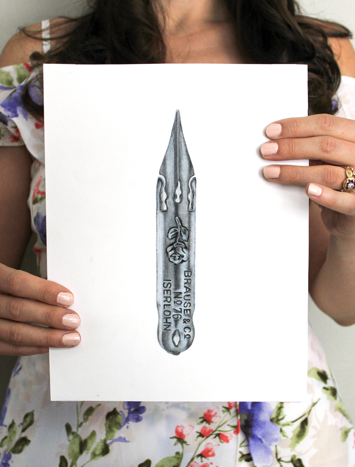
To be honest, I think I owe my initial interest in calligraphy to white calligraphy ink. I remember browsing through Etsy and seeing several envelopes featuring opaque white script. I wanted to be able to make beautiful envelopes like that, too! And yet, for the life of me, I couldn’t figure out what people were using to achieve that effect. It seems silly now, but at the time, I was dumbfounded.
Because it hadn’t occurred to me yet to turn to the internet for advice or supplies, I made a trip to Michael’s, where I found some Higgins “super white” waterproof drawing ink. Bingo, right?

Unfortunately, the Higgins was a crushing disappointment {well, at least for what I wanted to use it for}.

Finally, I did conduct an internet search and ordered some Winsor and Newton white calligraphy ink; it was love at first write. That was a couple of years ago, but it’s still the ink I use to this day. It’s also the ink I am going to talk about in this blog post. Now, if I lose you at any point, please don’t hesitate to comment! I’m glad to answer questions.

The Nibs
First of all, it’s important to understand that opaque white calligraphy ink isn’t really ink at all. There are no ingredients listed on the bottle, but the “ink” appears to be a slightly more watery version of acrylic paint. While “normal” inks like India inks and sumi inks play very nicely with many nibs, opaque white ink may trip you up a bit if you don’t combine it with a tolerant nib. The nibs I have great luck with when using white ink are:


{If all this nib talk is confusing to you, check out The Beginner’s Guide to Modern Calligraphy post.} If you generally have trouble using the Brause Rose nib with other inks, white calligraphy ink will be the ink that finally makes the nib easy {or easier} to get the hang of. I know that a lot of people experience issues initiating ink flow with the Rose; but the viscosity of white ink ensures that it gets started pretty well when using that nib! The Blue Pumpkin shouldn’t give you any issues. The EF66 is a good nib to use with white ink if you have used — and enjoy using — that nib with other inks in the past. Here’s the breakdown of the effect each nib will give you:
Brause Rose

You can see that using this nib with white ink can give you some really nice, thick downstrokes. The upstrokes, however, are not as thin as they could possibly be. That’s because the Rose nib isn’t as pointed as, say, the EF66.
Brause Blue Pumpkin

I generally use this nib for printed styles and Beth style calligraphy because it is not a nib that’s going to give you a superfine, hairline upstroke. When creating that style of calligraphy, that’s not a problem. The Blue Pumpkin won’t give you a lot of grief in general … it’s pretty accommodating to any ink you wish to use.
Brause EF66

This is my favorite nib in general because it has the potential to give you wonderfully thin upstrokes and thick downstrokes. That said, the nib can’t hold a lot of ink {white or otherwise}, and you’ll find yourself having to refill a lot. For some reason, too, it can be hard to get the ink flow started when using this nib with white calligraphy ink. Is it still worth a try? Oh, absolutely.
You may notice the conspicuous absence of one of the nibs I recommend often throughout the TPK blog: the Nikko G. I, personally, dislike using it to create white calligraphy because the ink seems to be a bit too thick for the nib. The Nikko G is great for less viscous inks, but I always encounter issues trying to use it with white ink. That may just be me, though: I do encourage you to try it for yourself!
Ink Consistency {Viscosity}
The single most confusing aspect of using white calligraphy ink is viscosity. Here’s the thing: when you receive/purchase your ink, it may not be ready to use quite yet. I know the Winsor and Newton white calligraphy ink generally arrives too runny, and I have heard the same about the Dr. Ph. Martin’s white {which, by the way, is also supposed to be a fantastic white ink; I just haven’t tried it yet}.

Now, what you want is ink that has the consistency of drinkable yogurt. It needs to be able to flow smoothly from your nib, but it can’t be too runny or else it won’t show up as opaque. The first thing to do once you receive white ink is to ascertain whether the consistency is correct. Take it for a little test drive on a dark piece of paper: if the ink doesn’t write opaque, your ink is too runny. If the ink simply refuses to write at all, it’s too thick.
If your ink is too runny, you should leave it unattended with the cap off for a couple of hours. This will allow some of the liquid to evaporate, which will give you the proper viscosity. You can set a timer if you’d like, and test the ink when the timer goes off. Don’t worry about letting the ink lose too much water; you can always add water back in.

If your ink is too thick, you’ll just add a few drops of water and shake the ink up until it reaches the consistency you need. If you add in too much water, you can employ the evaporation trick I just told you about. I make getting the right consistency sound like rocket science; but it’s really not. Give it a try, and you’ll see what I mean!
Writing Surface
One of the best things about using white calligraphy ink is you can write on various different surfaces, and you won’t have any issues with ink running! That’s because the ink is so thick that it just stays put. It won’t spiderweb out into absorbent paper fibers or give your letters fuzzy edges. The envelope below is a dark green metallic envelope created using Janet style calligraphy and a hand-drawn banner. This color/sheen of envelope looks awful with black ink, but add white and it pops!

Basically, as long as your paper is relatively dark, you’re good to go. Some of my favorite surfaces to use white ink on include:
- Magazine surfaces {I love making vintage magazines into envelopes; learn how to do that here.}
- Paper grocery sacks {These are also great to make into envelopes; note that your nib will likely catch on the paper fibers, so you’ll need to be patient with that.}
- Darker card stocks and/or envelopes

{You can learn how to make this envelope art in Amazing Envelopes for a Latté.}
Other Things to Remember
I want to add a disclaimer that if you opt to purchase the Winsor and Newton white calligraphy ink, you’ll need to keep it in a well-sealed container that is different from the jar it came in. Preferably, the jar should be designed so it’s easy to dip any nib or holder into. The design of the Winsor & Newton bottle makes it nearly impossible to dip your pen into {especially an oblique} after the ink level has dropped a bit from use. It seems to me that the Dr. Ph. Martin’s white calligraphy ink is set up much better for dipping from the get-go, so once I run out of my Winsor and Newton, I will more than likely refill my stash with Dr. Ph. Martin’s white ink.

You should also note that white calligraphy ink separates easily and will need a good shaking before each and every use. If you don’t use your ink relatively often, be sure and check on it once every couple of months or so to monitor whether it needs more water and a bit of shaking. The photo below shows what happens when you don’t give your white ink TLC for a year … oops.

If you are creating calligraphy on dark paper and you want to make guidelines, a soapstone pencil will revolutionize life as you know it. Soapstone pencils write so well on dark paper, and they erase off like a dream!

Finally, if you want to get that opaque white effect but aren’t quite ready for a dip pen and white ink, try using a Sakura Gellyroll white pen. {You can learn more about making white faux calligraphy in this tutorial.}
Applications
Of course, I use white ink for a lot of general letter-writing. Chances are your friends and family will have no idea how you created the sheer awesomeness that is the envelope you sent them. This will, naturally, gain you the reputation of being the classy artistic friend who has an irresistible air of mystery. {Not that people don’t think that about you already.}

I’ve also used white ink on a lot of wedding materials. I know I reference this hand-written suite a lot, but it’s one of my favorites. It was created using Kaitlin style calligraphy for a client who had a very small wedding {~14 guests}, so if you’re in the same boat, hand-writing all your invitation suites using white ink is an option. All of the card stock used in the suite was purchased from Paper Source. You could also implement this idea for invitations to a dinner party or similar event.

As far as events go, I also love making rustic escort tags using kraft paper and white calligraphy ink:

Finally, if you’ve got an Etsy shop or a business, it’s neat to make little “thank you” tags using dark paper and white ink. White ink isn’t something people see a whole lot, so it always makes an impression. I’m not promising you that white calligraphy ink will gain you return customers for life … but it doesn’t hurt your chances. 😉

In closing, if you were a bit confused or intimidated about white calligraphy ink, I hope this blog post helped to shed light on the topic {and has encouraged you to try writing with it}! If you have any questions or tips, please do comment! By speaking your mind, you’ll either help someone with your tip/s; or you’ll ask a question that a lot of other people are wondering, but are too shy to ask.

Have a wonderful weekend!
Warmly,


