Like many creative people, I love rediscovering forgotten past projects! In this article, we’ll take a look at some gems from several years ago that I hope will spark your inspiration. If you enjoy perusing these photos, be sure to check out my 10 Items That I Successfully Sold on Etsy and A Decluttering the Drawer…
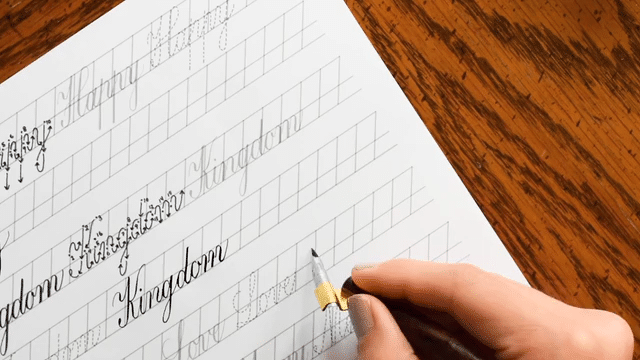
The Creative & Collected worksheets inspired me to organize past calligraphy projects. The worksheets have really helped to put me in a “can-do, let’s-tackle-this” kind of mode!
Almost every creative person is a little bit of a packrat. It’s impossible not to be, with all the art supplies you probably have on hand plus the projects you make! I wear my artistic packrat badge proudly, but I do have to admit that sometimes the clutter reaches a degree that makes me squirm. Last week, I allocated four days to organizing all my past lettering and calligraphy projects, and I came across several that I want to share with you today. Many of these projects have never appeared on the TPK blog before, and my hope is that they’ll spark some inspiration!
1. Baker Jay Envelope (2012)
This little gem of an envelope still shows up on my Pinterest feed. The photo floating around on Pinterest is dark and small, a leftover from the days when I offered this lettering style on Etsy. Despite the poor original photo quality, there’s something about the contrast between the recipient’s bold name and the simple address that appeals to people!
I created the lettering on this envelope with a Pilot G2 05 pen. The alphabet style used to write “Baker Jay” is a precursor of George Style Lettering.
What I would change today: If I were to re-do this lettering, I would try to center everything better. I’d also draw myself good pencil guidelines to ensure that the lettering in the address has a consistent height. Pencil guidelines would also help with vertical spacing, which is a little iffy here!
2. Chalkboard Holiday Card (2012)
I created the original design for this holiday card with a dull pencil, then I used Photoshop to invert the colors. (What was black became white and vice versa.) This gives the piece an authentic, chalkboard-style look! Once the colors were inverted, I inserted a photo that happened to complement the card’s color scheme.
What I would change today: Nothing! I’ve always loved this card’s playful design.
3. Funky Flower Envelope (2012)
I used crayons and a black pen to make this fun and colorful envelope! Most of the recipient’s address is in the flower, while the zip code hangs out in the leaf.
What I would change today: I’m not 100% confident that this mail art would make it through the postal scanners in its current format. If I re-did this envelope, I’d make the leaf more horizontal and ensure that the zip code is crystal clear (see tips for making deliverable mail art here). Instead of crayon and gel pen, I’d use waterproof ink and watercolors for better coverage and a more professional look.
4. Baby Shower Invitation (2013)
I whipped up this invitation for my brother’s baby shower. Fast-forward a few years, and “Baby Bugbee’s” seventh birthday party is this weekend! (Where does the time go?!)
What I would change today: I’m not huge on this color scheme, so I’d probably play a little bit more with it. Instead of working with the image in Photoshop, I used Illustrator, which I’m less familiar with and less “good at”. As a result, the image is in vector format and has calligraphy that looks inconsistent and computerized. If I had it to do over, I’d work with the graphics in Photoshop to result in a more natural-looking piece!
5. Wedding Invitation (2013)
This was the very first wedding invitation I ever made! It was also the first time I became acquainted with the concept of illustrated maps, which I fell madly in love with. (I even went on to make a Watercolor Illustrated Maps 101 eCourse!)
What I would change today: This invitation looks a little flat and computerized, so I’d try to come up with a similar design motif that features a letterpress printing technique. I do like the map, but I think it would also look better in letterpress — or with some watercolor added to it!
6. Pencil Draft of Dubai Wedding Map (2014)
This lovely little piece isn’t complete because the client decided not to incorporate a map into their wedding suite after all. I still love to look at it, though! All those fabulous windows in the Waldorf Astoria catch the eye, and the rest of the buildings have a pleasing, rounded quality. It would have been fun to continue with this, so it’s too bad it never went beyond the draft stage!
What I would change today: If I were to re-do this draft, I’d move the Hotel Sofitel down a bit. There needs to be some breathing room between the hotel and the edge of the paper! I think I’d also incorporate some Arabic-inspired embellishments around the couple’s names and in the upper right and lower left corners. As-is, the map looks just a bit bare to me! (You can learn how to critique your own map drafts in the Watercolor Illustrated Maps 101 eCourse.)
7. Watercolor Jewel (2015)
I’ve always admired how cheerful and vibrant this little card is! I actually created it for a tutorial, which you can read here. I especially admire the casual Kaitlin Style calligraphy and the lettering underneath the jewel.
What I would change today: If I do this project again — and I probably will — I’ll pay more attention to making balanced facets of the jewel. Doing that will result in a cleaner, more professional look!
8. Circular Mail Art (2015)
This simple mail art, with its white and kraft color scheme and whimsical lettering, has always been one of my favorites! I think the motif works especially well on square envelopes.
I’m not sure that the post office scanner would be able to read this zip code. I’d be taking a gamble with that tiny “4” if this were a real address!
What I would change today: I actually ended up making an envelope like this one, but in A7 size. (You can see it here.) For that envelope, I made the zip code much legible and the address cleaner. I think I still prefer the original, though!
When I look through my past calligraphy projects, I often feel a spark of inspiration to try making them again! It’s amazing how much difference a bit of practice can make between try #1 and try #2. I hope that some of my early works also spark an idea for you — either for a new piece of mail art, a cool card, or a nice invitation idea. Thanks very much much for looking through these with me, and enjoy the rest of your day!
To provide the best experiences, we use technologies like cookies to store and/or access device information. Consenting to these technologies will allow us to process data such as browsing behavior or unique IDs on this site. Not consenting or withdrawing consent, may adversely affect certain features and functions.
Functional
Always active
The technical storage or access is strictly necessary for the legitimate purpose of enabling the use of a specific service explicitly requested by the subscriber or user, or for the sole purpose of carrying out the transmission of a communication over an electronic communications network.
Preferences
The technical storage or access is necessary for the legitimate purpose of storing preferences that are not requested by the subscriber or user.
Statistics
The technical storage or access that is used exclusively for statistical purposes.The technical storage or access that is used exclusively for anonymous statistical purposes. Without a subpoena, voluntary compliance on the part of your Internet Service Provider, or additional records from a third party, information stored or retrieved for this purpose alone cannot usually be used to identify you.
Marketing
The technical storage or access is required to create user profiles to send advertising, or to track the user on a website or across several websites for similar marketing purposes.
TPK’s innovative newsletters are an artistic treat. Join the 125K+ subscribers who have already discovered The Postman’s Knock, and receive 10% off your first Digital Catalog order.
Unlock Exclusive Perks with Premium Plus
Fuel your inspiration and creativity with TPK Premium Plus! Members enjoy three free worksheets or learning resources every month, unlimited video course access, member-exclusive tutorials, and a 10% discount on all Supplies Shop orders.