After I wrote The Beginner’s Guide to Modern Calligraphy, I received some questions via email and comments that led me to believe a follow-up post would be helpful. Let me begin by saying that if you’re completely new to calligraphy, I wouldn’t invest in a dip pen just yet. Instead, you might consider building up muscle memory with a regular pen and a faux calligraphy technique. Not only will your hands become accustomed to forming letters without hesitation/trepidation, but you will also gain an understanding of upstrokes and downstrokes.

You probably know that I nearly always use an oblique calligraphy pen to create modern calligraphy. However, I don’t recommend jumping straight from a regular {meaning: ballpoint, gel, etc.} pen to an oblique pen. Instead, you’ll do yourself a favor by purchasing/using a regular straight pen.

There are lots of great places to get one; I, of course, love my Rodger’s Pen Box straight pen, but you can get away with buying a standard, cheap straight pen made from whatever material — for example, this one. The important thing is that the pen has a metal insert like the one pictured below to hold the nib.

The metal insert basically just ensures that the pen can accommodate whatever type of nib you want it to. If you have a pen without this insert {like the Speedball plastic pens}, you can still use certain nibs {e.g. the Nikko G}, but you’ll have a difficult time fitting others in.
Which brings me to my next topic: nibs.

Someone wrote asking if it’s weird that they are completely attached to their Blue Pumpkin nib. The answer is a resounding “no”. It’s completely normal to identify favorites and only want to use them. I, personally, use the Brause EF66 nib 90% of the time. The other 10%, I am using one of the nibs covered in this blog post, or the Leonardt Principal EF, which I was recently introduced to. You should use what you’re comfortable with; not only will it make your calligraphy experience more pleasant, but it will make your work look better.

If you have just approached the point where you are ready for nibs and you’re completely stuck on which ones to buy, here’s the list I recommend. Buy one of each to start {nibs are cheap!}:
- Nikko G: This is arguably the best beginner nib because it’s strong, its tines aren’t super flexible {which means they won’t catch on your paper as much}, and it gives you consistently thin hairlines.
- Brause Steno {“The Blue Pumpkin”}: I use this to write in print because it gives me good control. It’s also a good beginner nib because it’s not fussy, but it’s more flexible than the Nikko G.
- Brause Extra Fine 66: My personal favorite. It’s tiny, but not delicate, and allows for itty-bitty upstrokes and thick downstrokes.
I have also recommended the Brause Rose nib in the past; but I am finding that sometimes beginners find it a little bit temperamental; so maybe wait on that one until you have a little more experience under your belt.
Now that your nib queries have {hopefully} been answered, let’s move on to the big question: when should a person start using an oblique pen?
 First things first: if you just looked at the photo above and thought to yourself, “What the …?”, then read this blog post.
Now that you’ve read the post above and effectively have the knowledge you need regarding the whats and whys of oblique pens, let’s talk about when you’re ready to use one. My personal opinion is you are ready to use an oblique pen after spending some time acquainting yourself with a straight pen — and that applies to both right-handed people and left-handed people. There are a couple of reasons I recommend this:
- Using a straight pen helps you to determine which nib/s you like, and you can order your oblique pen fitted for that/those nibs.
- You will more easily get the hang of increasing/decreasing pressure to make thick vs. thin lines on a straight pen {since it’s more like the pens you have been using since before kindergarten}.
- Using a straight pen will teach you that you can create calligraphy, which makes it a lot harder to get discouraged when you move on to the oblique pen. Your thought process will be, “OK, I know I can do this with a straight pen, so with some practice I can do it with this pen, too.”
You may be wondering how to hold the oblique pen. You basically just want to hold it such that both tines of the nib are touching the paper evenly.

A closer look:

Lefties, you will hold a left oblique just like this, but mirrored … if that makes sense.
Another question I get a lot concerns ink flow. First, let’s talk about how far to dip, regardless of whether you are using a straight or oblique pen:

You don’t want too little ink on your nib, but you also don’t want too much ink on there. That’s why it’s good to dip halfway up the vent hole {the oval/fleur de lis/whatever-shaped hole in the middle of your nib}. It’s always better to err on the side of too little ink rather than too much. If you’ve got too much ink on there, when you put your nib to the paper, gravity will work its magic and all the heavy ink will rush down to the paper, leaving you with an ink blot {and frustration}. Here’s what my Brause EF66 nib looks like after proper dipping:

If you are having trouble getting your ink to flow, try “kissing” the tip of the nib to water as described in The Beginner’s Guide to Modern Calligraphy {part one}. If that doesn’t work, you may need to prime your nib. All {metal} calligraphy nibs are treated with a fine oil by the manufacturer to prevent rusting during shipping/storage. Some of that oil may remain on your nib, which will give you difficulty when you try to write.

To get rid of that oil, you can run the nib through a match very quickly. I have used this method before and it works — though it is hotly contested on some calligraphy websites. A less firey method is to clean your nib with a soft toothbrush and, warm water, and dish washing liquid. Dry them off completely, and you’re good to go!
A lot of people ask me about supplies. If you’re wondering which ink and paper I use for calligraphy, check out this blog post.
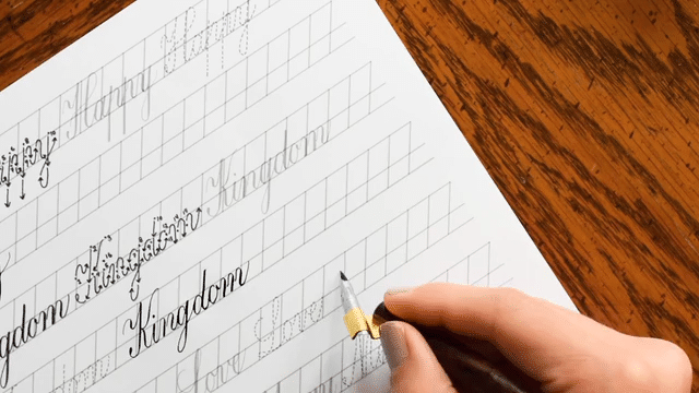
As far as where to start, I’ll always point beginners to the Learn for a Latté worksheets.

These worksheets are developed to walk you through learning the style from start to finish. First, you begin with faux calligraphy, then you move on to dip pen calligraphy. For those who are unfamiliar with a dip pen, I’d recommend completing the dip pen sections with a straight holder first. Once you get the hang of that, you can move on to an oblique pen, quite easily.
To my absolute delight, I have been seeing a lot of people on Instagram using the worksheets very effectively! One kind soul even made the comment that she had paid a significant amount of money for a calligraphy workshop last summer, and she was learning more with her For a Latté worksheet than she learned in the workshop! {Of course, I can’t find the exact comment on my Instagram … go figure. But I promise she said it! And it made me happy.}

If you’re wondering where to start with the Learn for a Latté worksheets, the truth is you could start with any one of them. However, I would personally choose to learn them in this order:
- The Kaitlin – This is my favorite style to use because it’s so low-maintenance. It doesn’t require measuring guidelines or making sure your slant is just-so. It’s a very modern style, the kind that looks amazing whether it’s on casual snail mail correspondence; or a beautiful letterpress wedding invitation suite.
- The Janet – I like how formal this style looks. It does require a little more fuss because you need to draw guidelines, and the slant matters. The final result, however, is worth the extra trouble.
- Flourish Formal – This was the first worksheet I created; it’s somewhat similar to the Janet, but it isn’t as closely related to copperplate. You can really go crazy with the flourishes, which I {as a flourishy-type person} love.
- The Beth – I create this style with a straight pen {and a Brause Steno nib}, which is why it’s good for beginners. It’s a pretty, modern, no-frills style — though, like Flourish Formal and Janet, it requires guidelines and a consistent stand.
I think that this post pretty much covers all the questions I have received lately — but if I missed something, please, let me know in the comments! If you have any input/advice for learners, also feel free to comment. The comments are one of my favorite parts of having this blog … I learn just as much or more from you as you do from me!
Thanks so much for reading!
Warmest wishes always,