Today, you’ll learn everything you need to know about calligraphy letter size, including tips for different projects and how to achieve harmonious proportions.
How do you determine the best calligraphy letter size for your project? We’ll explore the answer to that question in today’s article.
Yesterday, TPK reader Alisa emailed me with a question: “Can you write an article about the size of the letters on the envelopes, how tall they are? Because sometimes it seems to me that I write letters that are too small. I don’t know how to choose the right size.” Alisa certainly isn’t alone: it’s tough to choose the perfect letter size, especially when projects vary from envelopes to large pieces of artwork. Today, I’ve written a guide to help you find the right size for different types of calligraphy projects.
Sometimes, you’ll find that you use different sizes of letters within the same project. With it comes to envelope calligraphy, it’s often a good stylistic choice to write a recipient’s name larger than their address.
Understanding the Importance of Letter Size
Why Size Matters
Letter size can affect the readability and aesthetic appeal of your calligraphy. Too small, and the text may be hard to read. Too large, and the letters may look unbalanced or juvenile. On top of size, you have to consider balance. A piece should maintain harmony in proportions, where each element complements the others without overpowering them.
I created this baby shower invitation over a decade ago, when I was at the beginning of my calligraphy journey. It would have benefitted from more strategic calligraphy letter sizing.
In some cases, harmonious proportions means writing calligraphy that’s all the same size. In other cases, and especially for projects like invitations or calligraphy art, it’s easiest to strike a balance when you vary the letter sizes. Here’s a good general rule to follow: If you have ample space and limited text, maintain a consistent letter size. For constrained space and abundant text, vary the letter sizes to ensure readability and balance.
In this flourished piece, the letters are all the same size. The x-height is one square, with an ascender height of two squares.
Different Projects, Different Sizes
Every project is different, and so is every calligrapher. There is no specific rule that you have to follow for any given project, but I’ve outlined a few guidelines below that might help for different types of projects.
Envelopes
For envelopes, you want the recipient’s address to be easily readable at a glance. Typically, lowercase letters should be about 1/4″ to 1/2″ tall (~6mm to 12mm). If you choose to go larger, make sure your calligraphy has enough space to breathe. An envelope with a generous blank border looks best.
You can learn how to make a perfectly centered calligraphy envelope in this tutorial.
Invitations
Invitations require a more elegant approach. Lowercase calligraphy letters should be around 1/8″ to 1/4″ inch tall (~3 to 6 millimeters). This size allows for the text to be readable and stylish without overwhelming the design. If you can, incorporate some small block lettering into the design as well.
When choosing the right letter size, you’ll take into account a number of factors. That includes paper size, the information you want to showcase, and the purpose of the project.
Wall Art
When making decorative wall art, legibility from a distance typically isn’t an option. Instead, focus on the composition as a whole in order to draw the viewer in for a closer look. The goal is to create artwork that not only showcases beautiful calligraphy but also encourages engagement through its balanced design.
The Kaitlin Style calligraphy on this piece forms a neatly centered, balanced block. (You can learn how to write out a casual quote like this one in this tutorial.)
Tools and Materials That Impact Letter Size
When it comes to achieving the best results in calligraphy, understanding the impact of nib sizes, ink viscosity, and paper types is essential. Below, you’ll find a few key points to keep in mind.
Nib Size
Different nib sizes will drastically change the appearance of your letters. Low-flex (e.g. crowquill nibs) are great for writing tiny letters. Medium-flex nibs (e.g. the Nikko G) are good for medium-sized letters. High-flex nibs (e.g. the Brause Rose or the Brause EF66) are best for larger letters.
Generally, smooth paper works well for smaller, intricate letters, while textured paper requires larger letters to maintain legibility. Good smooth paper choices include 32# HP Premium laserjet, Rhodia, or 80# drawing paper. Nice textured paper picks are 140# watercolor paper or Indian Cotton Paper Co. handmade paper.
This textured handmade paper offers a unique tactile quality, but it can pose challenges for small, intricate lettering. The uneven surface may cause the ink to spread unpredictably, making fine details harder to achieve.
Ink Type
For polished-looking small calligraphy letters, you just about have to use a thin ink like iron gall. To write larger letters, you can use any ink (including thin inks). Viscous inks like Bleed Proof White and gouache will be especially impactful, however, since they generally make thicker upstrokes.
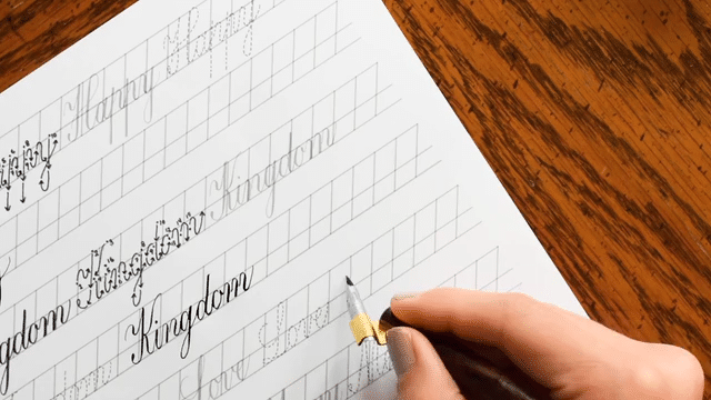
After reading through all this, you might wonder how to actually implement the proper letter size for your project. Pencil guidelines are the key! To figure out the x-height and the height of uppercase letters, make a draft of your longest line of calligraphy on a scrap piece of paper. Play with the sizing of that line until it fits comfortably within the space you’ll be using.
To determine the size of my letters for this envelope calligraphy project, I experimented with how to fit “State College, Pennsylvania 16803” on an A7 envelope because it was the longest line on my list of addresses. Don’t forget to make sure your calligraphy has some breathing room! You don’t want it to extend from one end of the page to the other.
Once you’ve determined the ideal size for your calligraphy, focus on the line spacing. It’s a good idea to experiment with different line spacings in a pencil draft to find the right balance for your specific project. Write a few test lines, adjusting the spacing until you’re happy with the effect.
If you would like to use ready-made calligraphy guidelines, you can find a set of seven helpful printables here.
If you’re stuck on deciding and you’d prefer to use an established formula, traditional calligraphy styles like Copperplate usually follows a set ratio where ascenders are about 1.5 to 2 times the height of the lowercase letters. However, in modern pointed pen calligraphy, you have more freedom. You can experiment with different ratios to find what looks best and achieves the effect you’re aiming for. It’s all about what feels right to you and complements your project.
When choosing your letter sizes, it’s important to remember that people gravitate to hand-written calligraphy for a reason. If you mess up, the effect will likely be endearing and visually interesting rather than repellant. So, don’t be afraid to experiment! Make pieces that mix different sizes of calligraphy, then make other pieces that prioritize consistency.
These envelopes showcase a variety of different calligraphy styles and sizes.
The more you play, the more you’ll develop your preferences, which brings me to the point of this article: choosing the right calligraphy letter size all boils down to you. It’s about your personal style, the materials you’re working with, and what you hope to achieve in your project. Tossing aside the fear of messing up is the most important thing. Instead, roll up your sleeves, experiment, and own the result with pride!
If you have any questions about calligraphy letter sizing, materials, or techniques, feel free to ask in the comments. I’m always here to help!
To provide the best experiences, we use technologies like cookies to store and/or access device information. Consenting to these technologies will allow us to process data such as browsing behavior or unique IDs on this site. Not consenting or withdrawing consent, may adversely affect certain features and functions.
Functional
Always active
The technical storage or access is strictly necessary for the legitimate purpose of enabling the use of a specific service explicitly requested by the subscriber or user, or for the sole purpose of carrying out the transmission of a communication over an electronic communications network.
Preferences
The technical storage or access is necessary for the legitimate purpose of storing preferences that are not requested by the subscriber or user.
Statistics
The technical storage or access that is used exclusively for statistical purposes.The technical storage or access that is used exclusively for anonymous statistical purposes. Without a subpoena, voluntary compliance on the part of your Internet Service Provider, or additional records from a third party, information stored or retrieved for this purpose alone cannot usually be used to identify you.
Marketing
The technical storage or access is required to create user profiles to send advertising, or to track the user on a website or across several websites for similar marketing purposes.
TPK’s innovative newsletters are an artistic treat. Join the 125K+ subscribers who have already discovered The Postman’s Knock, and receive 10% off your first Digital Catalog order.
Unlock Exclusive Perks with Premium Plus
Fuel your inspiration and creativity with TPK Premium Plus! Members enjoy three free worksheets or learning resources every month, unlimited video course access, member-exclusive tutorials, and a 10% discount on all Supplies Shop orders.