Join us for the all-new Beginner’s Modern Calligraphy Online Course, happening now! →

Learn More
    • Facebook
    • Instagram
    • Pinterest
    • RSS Feed
    • YouTube
    • Premium Membership
    • Beginner Calligraphy Course
    • Intermediate Calligraphy Course
    • Calligraphy Worksheets
    • Beginner Watercolor Course
    • The Calligraphy Book
  • Blog
    • Pointed Pen Calligraphy Worksheets
    • Pointed Pen Calligraphy Drills
    • Video Courses
    • Brush Pen Calligraphy
    • Handwriting
    • Hand-Lettering
    • Mail Printables
    • Printable Artwork
    • Procreate Worksheets
      • Cleaning Cloths
      • Erasers
      • Glass Jars
      • Inks
      • Kits
      • Mechanical Pencils
      • Nibs
      • Oblique Pens
      • Paper
      • Protectants
      • Rubber Stamps
      • Rulers
      • Straight Pens
      • Washi Tape
      • Watercolors
      • Wax Seals
  • Help
  • Cart
Log in

Your cart is currently empty!

The Postman's Knock written in calligraphy
Subscribe for $1/week
Sign In
  • My Account
    • Account Details
    • Addresses
    • Payment Methods
    • Order Receipts
    • Subscriptions
    • Printables + Worksheets
    • Video Courses
  • Help
Log in
The Postman’s Knock
  • About
  • Blog
  • Shop
  • Help
  • Premium Membership
  • The Calligraphy Book
Subscribe for $1/week
Sign In
  • Welcome to TPK! This is your first of 2 free articles. For unlimited access to tutorials and articles, join TPK Premium for less than the cost of a latte.

    How to Use a Dip Pen to Create Modern Calligraphy

    August 28, 2018

    by

    Lindsey Bugbee

    Beginner’s Calligraphy, Calligraphy, Dip Pen Calligraphy, Inks, Nibs, Straight Pen Holders, Tutorials, Video

    I wrote the first version of this tutorial on September 3, 2013. After five years of experience writing (and writing about) calligraphy, it was clear that this post needed a facelift! I hope that you like this new version of How to Use a Dip Pen to Create Modern Calligraphy, and that you’ll comment or…

    • Click to share on Pinterest (Opens in new window)Pinterest
    • Click to share on Facebook (Opens in new window)Facebook
    • Click to share on WhatsApp (Opens in new window)WhatsApp
    • Click to share on X (Opens in new window)X
    • Click to share on Bluesky (Opens in new window)Bluesky
    • Click to share on Threads (Opens in new window)Threads
    • Click to share on Reddit (Opens in new window)Reddit
    • Click to share on Mail (Opens in new window)Mail

    How to Use a Dip Pen to Create Modern Calligraphy | The Postman's Knock

    I first picked up a dip pen in 2005. At that time, it seemed to be best suited to making squiggles because it was tough to write letters with! Fast forward a few years, though, and I saw other people using these mysterious instruments to create modern calligraphy. Flowy alphabets with a beautiful contrast abounded, and I wanted to know how to do that myself!

    How to Use a Dip Pen to Create Modern Calligraphy | The Postman's Knock
    This shows one of my first attempts with a dip pen, which I created in a sketchbook. You have to admit that a dip pen is great for abstract lines and curves!

    The dip pen can be tough to get the hang of at first! However, if you remember some key principles, you’ll be able to use it to create modern calligraphy in a matter of minutes. In this short tutorial, you’ll learn how to create a simple calligraphed piece using your dip pen and ink.

    1. Get a Straight Dip Pen, Ink, and a Nikko G Nib

    You can find a straight dip pen at virtually any art supply store. Just a cheapie Speedball black plastic pen will work for this tutorial! As far as ink goes, if you can snag some sumi, that’s a great choice, but India ink works just as well.

    How to Use a Dip Pen to Create Modern Calligraphy | The Postman's Knock
    I like using Manuscript straight pens, but the Nikko G nib will fit in almost any straight dip pen!

    If you’re not familiar with using a dip pen, I recommend that you use the Nikko G nib (or any other manga nib, like a Zebra G or Tachikawa G) for this tutorial. These are all semi-flexible nibs, meaning that they won’t respond dramatically to any pressure you put on the pen. That’s a good thing for beginners, who, when faced with a flexible nib, will often apply pressure to the wrong part of the nib, which causes discouraging ink flow issues.

    How to Use a Dip Pen to Create Modern Calligraphy | The Postman's Knock

    Helpful resources for this step: For a list of international calligraphy supply merchants, you can click here. To learn how to assemble a dip pen, you can click here.

    2. Draft Your Calligraphy on a Piece of Paper

    First, pull out a calligraphy-friendly piece of paper. You can find a list of some of the best calligraphy papers in this article — because not all papers are created equally! Once you’ve got your piece of paper, cut it to 5” x 7” (127 mm x 178 mm), which is a nice, framable size. Use a pencil to draw three pairs of equally-spaced horizontal guidelines and one vertical, centered guideline.

    How to Use a Dip Pen to Create Modern Calligraphy | The Postman's Knock
    I’m using drawing paper in this tutorial. My guideline pairs are 3/16″ (~5 mm) apart, with 1/2″ (~13 mm) of space between the lines in each pair.

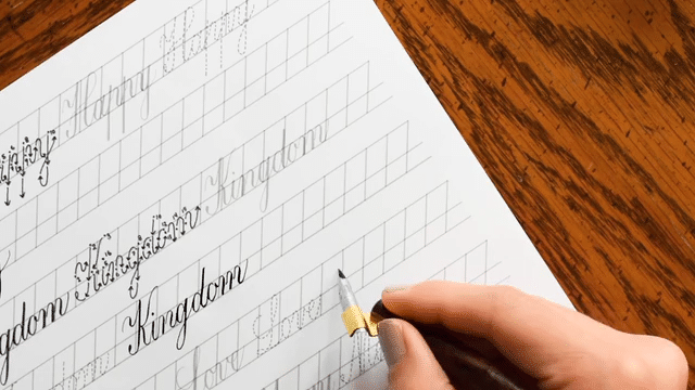
    For this next step, remember that you’re creating your own modern calligraphy — there are no rules here! Pull out your pencil, then write on your horizontal guidelines using either a larger version of your own cursive style, or you can mimic a different writing style (I am using Kaitlin Style calligraphy below). Write “Paris is Always” on the first line, “a Good Idea” on the second line, and “- Audrey Hepburn” on the third line.

    How to Use a Dip Pen to Create Modern Calligraphy | The Postman's Knock
    Write your pencil guidelines and your draft with a soft touch! You’ll be erasing them later.

    Helpful resources for this step: How to Make Your Own Calligraphy Styles, What *Is* Modern Calligraphy, A Creative Calligraphy Challenge, How to Make Calligraphy Quote Art

    3. Go Over Your Draft with Your Dip Pen

    If you have never used a dip pen, know that there’s just a bit of a learning curve. You can find details in The Beginner’s Guide to Modern Calligraphy, but here’s what to remember in a nutshell:

    • Dip the pen in ink to just above the middle hole in the nib (the “vent”), and give the pen a firm shake to encourage excess ink off.
    • Maintain a 45 degree-ish angle between the paper and the pen
    • Always exert even pressure to both tines of the nib; do not apply more pressure to one side or the other.

    I filmed myself going over this calligraphy so you can see exactly how I do it. If you’re having trouble viewing the video below, you can watch it on YouTube!

    Once you’re finished, let the calligraphy dry. This should only take 2-5 minutes if you used sumi or India ink.

    Helpful resources for this step: The Lowdown on Calligraphy Nibs (to learn nib anatomy), The Beginner’s Guide to Modern Calligraphy, The Beginner’s Modern Calligraphy Online Course

    4. Erase Your Pencil Guidelines

    Firmly hold down your calligraphy with one hand while you use gently erase the pencil guidelines on your piece. Be especially careful around the edges of the paper — if you rub too vigorously, the edges have a tendency to crinkle and fold!

    How to Use a Dip Pen to Create Modern Calligraphy | The Postman's Knock
    I prefer to use Staedtler Mars plastic erasers to get rid of my guidelines … they’re very clean and effective!

    5. Enjoy!

    Feel free to display your calligraphy on a bulletin board, frame it, or send it off as a piece of mail art. However you choose to use it, be proud that you took the time and had the patience to use a dip pen to create this modern calligraphy. It’s not an easy — or common — writing instrument to use, so know that what you just did is interesting, artistic, and special!

    How to Use a Dip Pen to Create Modern Calligraphy | The Postman's Knock
    A helpful resource for this step is the How to Frame Artwork on the Cheap tutorial!

    I hope that this post was helpful to you as an introduction to using a dip pen for creating modern calligraphy! Once you’ve created one piece with a dip pen, you can always create more. Next time, maybe try making some mail art! The more you write, the more you’ll be impressed with your own skills, so don’t hesitate to practice and experiment.

    How to Use a Dip Pen to Create Modern Calligraphy | The Postman's Knock

    Thanks very much for reading TPK and have a great week!

    Warmly,

    Lindsey's Signature | The Postman's Knock

    • Click to share on Pinterest (Opens in new window)Pinterest
    • Click to share on Facebook (Opens in new window)Facebook
    • Click to share on WhatsApp (Opens in new window)WhatsApp
    • Click to share on X (Opens in new window)X
    • Click to share on Bluesky (Opens in new window)Bluesky
    • Click to share on Threads (Opens in new window)Threads
    • Click to share on Reddit (Opens in new window)Reddit
    • Click to share on Mail (Opens in new window)Mail
Sketchbooking

About the author

Hi, I’m Lindsey Bugbee, the illustrator, calligrapher, and author behind The Postman’s Knock (TPK). Since 2012, the TPK Blog has been a vibrant creative space filled with tutorials and lessons on modern calligraphy, hand lettering, and illustration. After publishing The Calligraphy Book, I wanted to elevate the quality of content even further—so I launched TPK Premium. You can join here to receive access to some of the internet’s best creative inspiration and project tutorials.

Join TPK’s free mailing list

This field is for validation purposes and should be left unchanged.

Follow TPK on social media

  • Facebook
  • Instagram
  • Pinterest
  • YouTube
  • RSS Feed
  • Mail
Previous post: Artistic DIY Key Tag Labels Tutorial (Includes Free Printable)
Next post: Elegant Printable Watercolor Cards + a Freebie

All-time favorite posts

  • The Beginner's Guide to Modern Calligraphy

    The Beginner’s Guide to Modern Calligraphy

    1.5m views
  • 8 Tips to Improve Your Handwriting (Plus a Free Worksheet) | The Postman's Knock

    8 Tips to Improve Your Handwriting (Plus a Free Worksheet)

    839.6k views
  • Painting with Watercolors for Beginners

    Painting with Watercolors for Beginners

    807k views
  • Free Brush Pen Calligraphy Worksheet

    Free Brush Pen Calligraphy Worksheet

    481.7k views
  • How to Write Faux Calligraphy (Video Tutorial + Free Worksheet)

    362.4k views
  • 11 Calming Calligraphy Drills Printable | The Postman's Knock

    Celebrating Six Years of the “11 Calming Calligraphy Drills” Worksheet (Free Download)

    290.3k views
  • Lovely Loose Watercolor Flowers Tutorial

    Lovely Loose Watercolor Flowers Tutorial

    203.8k views
  • The Ultimate DIY Modern Calligraphy Starter Kit

    The Ultimate DIY Modern Calligraphy Starter Kit

    185.7k views

Latest posts

  • Floral calligraphy by Phyllis Macaluso
    8 Pieces That Helped Me Fall in Love With CalligraphySeptember 5, 2025
  • Athletic shoe created in flourishing
    Introducing the Flourished Athletic Shoe WorksheetAugust 27, 2025
  • Illustrated recipe for chocolate lava cake
    How to Make a Keepsake Illustrated RecipeAugust 20, 2025
  • Artwork on a light box
    August’s Creative Coffee Date: Your Questions, AnsweredAugust 18, 2025

Browse by category

Browse by date

103 responses

  1. ellie Avatar
    ellie
    June 20, 2015

    Hi, thanks for the great tutorial I’ve recently purchased a calligraphy pen set with some nibs from a local art shop but I seem to be getting too much ink from the nib when I try to write which looks messy and makes it hard to get thin lines as part of the letter. I was wondering if you know why this could be if I am doing anything wrong? Thanks again and I love your modern calligraphy style it looks amazing.

    Log in to Reply
    1. Lindsey Bugbee Avatar
      Lindsey Bugbee
      June 21, 2015

      Hi Ellie!

      I would recommend procuring the nibs that are recommended in the Ultimate Modern Calligraphy Starter’s Kit. The nibs are cheap {they’re available at Scribbler’s in the UK}, and they should really help with your ink flow. You might also try using sumi ink, if you’re not already. It’s a great, approachable beginner’s ink. 🙂

      Log in to Reply
  2. GJ Avatar
    GJ
    May 31, 2015

    Hey Lindsey!
    I have just recently gotten a dip pen for calligraphy and I have been practicing letters and stuff, but my problem is that when I write the ink doesn’t really flow at all if you know what I mean? So I will sometimes try pushing harder thinking that maybe the ink will come out then, but it doesn’t work. Do you have any tips for me? I am also left handed would that be why? Thanks so much for your help!
    GJ

    Log in to Reply
    1. Lindsey Bugbee Avatar
      Lindsey Bugbee
      June 3, 2015

      Hi GJ!

      Pushing hard, as you discovered, won’t help. The problem isn’t related to you being left-handed, I can promise you that as well. 🙂 The problem may be your nib {try using a Nikko G} and/or your ink {try starting with sumi ink}. If you explore some of the other calligraphy-related posts on this blog {check out this Pinterest board for a “menu” of sorts}, you may pick up some other tips that will help!

      Let me know if you have any other questions, or continue to have issues with this problem!

      Log in to Reply
  3. Deborah Avatar
    Deborah
    January 4, 2015

    Hi, I have a problem where when i start writing immediately after dipping my pen into ink, I always get way too much ink on my downstrokes and they pool (or worse – bleed!) and as a result, my letters don’t look very even. I’ve tried getting rid of the initial excess by writing one or two down strokes on a scrap piece of paper or even dotting my nib to get rid of the first lot of ink, but still no luck. I either end up with very little ink left or having the same problem of having too much ink.

    I find that this is especially so when I use more flexible pen nibs like the Zebra G. It’s less prevalent with the Nikko G, but I do like to use the Zebra G because of the flexibility for certain cases and was wondering how if you knew how to rectify this. It really is quite frustrating because it writes beautifully otherwise!

    Thank you.

    Log in to Reply
    1. Lindsey Bugbee Avatar
      Lindsey Bugbee
      January 8, 2015

      Hi Deborah!

      Are you dipping your nib into the ink such that the ink only extends halfway up the vent hole? I think {hope!} as soon as you hit the “sweet spot” of getting just enough ink on your nib, you won’t have this problem.

      That said, I’d also try some different nibs. I used to use the Nikko G a lot, but now I favor nibs like the Leonardt EF, the Brause EF66, and the Brause Steno. I have noticed a positive change in my calligraphy since I switched … though that just may be due to practice and not necessarily the nib. 🙂

      I hope this helps at least a little bit! Let me know if you have any more questions!

      Log in to Reply
  4. Andrea C. Avatar
    Andrea C.
    December 15, 2014

    Hi Lindsey!

    I really appreciate Your blog. One thing I have had trouble finding an answer to is this: what direction should the nib be facing as I write? I know it is supposed to be 45° to the paper, but when I’m looking down as I write, should I see the side of it or mostly just the flat part? It feels most natural when most of the nib is visible versus just the side. What are your thoughts?

    Thanks in advance!

    Andrea

    Log in to Reply
  5. Donille Avatar
    Donille
    December 12, 2014

    Hi,

    Bought recently some nibs and I had no idea how to use them properly (yes, i was frustrated just like you said). Your post was VERY useful to me. Thank you!

    Log in to Reply
    1. Lindsey Bugbee Avatar
      Lindsey Bugbee
      December 12, 2014

      I’m so glad! Thank *you*!

      Log in to Reply
  6. Katie Avatar
    Katie
    December 9, 2014

    Thank you for this tutorial! I’ve been trying to address Christmas card envelopes with my calligraphy set but when I go to write on my kraft brown envelopes, the india ink blots and runs/spreads terribly! It doesn’t do this on the various kinds of white paper I practice on but when I move to the kraft envelope, it is like a spider web effect… not good! Are you supposed to use a certain kind of envelope or ink to write calligraphy on?

    Log in to Reply
    1. Lindsey Bugbee Avatar
      Lindsey Bugbee
      December 13, 2014

      Hi Katie!

      I know exactly what you’re talking about. Your issue here is paper that is absorbent, and ink that is too thin for that absorbent paper. To tell you the truth, I avoid using India ink with kraft, precisely because of the issue you describe. I almost always use white (Winsor & Newton) or gold ink (Finetec) on the kraft paper. Those inks don’t run because they’re pretty viscous, so there’s no spider-webbing. If you’re in a time crunch, I would go ahead and get lighter envelopes to write on and use the India ink on those. You can keep the kraft envelopes and write on then with white ink throughout the year, as you get more comfortable using that ink. One can never have too many kraft envelopes around!

      An alternate solution would be to add a little bit of gum arabic to a quantity of your ink, to make it thicker. As a rule of thumb, the thicker the ink, the less likely it is to absorb quickly into the paper. 🙂

      Log in to Reply
      1. Nancy Avatar
        Nancy
        July 18, 2016

        Can you give us some guide lines as to how much gum arabic to add to the ink? Thanks.

        Log in to Reply
        1. Lindsey Bugbee Avatar
          Lindsey Bugbee
          July 29, 2016

          Hi Nancy! I wish I could, but it really depends on the ink consistency and quantity. My advice would be to add the gum arabic about 1/8 tsp. at a time!

          Log in to Reply
  7. Cindy Avatar
    Cindy
    November 26, 2014

    This is so helpful thank you!

    Log in to Reply
    1. Lindsey Bugbee Avatar
      Lindsey Bugbee
      December 13, 2014

      You are welcome! Thank *you* for reading!

      Log in to Reply
  8. amanda wood Avatar
    amanda wood
    October 28, 2014

    Hi there, I love your work so thought id have a try! Im getting on ok except for one problem. Im right handed and have always handwritten with my pen pointing with my hand at 90 degrees to my writing and the pen held east west rather than with my hand underneath my handwriting and the pen in a north south position (is this making sense?!) Im starting with a nikko g nib which I like and a straight pen holder. The issue I have is I can not get my hand into a position where my letters are straight, they lean to the left. I have had arthritis in my hands since I was 20 and 19 years later im not going to be able to train my hand to get the letters to slant to the righthand side. Might I be better off using an oblique holder? Any tips? Thanks so much. Amanda

    Log in to Reply
    1. Lindsey Bugbee Avatar
      Lindsey Bugbee
      October 30, 2014

      Hi Amanda!

      Ever since I was young, I’ve rotated the paper to get the slant I want. I remember classmates gawking at me in school because my paper was nearly horizontal! You might experiment with rotating the paper to see if that helps you to make any progress.

      Your tools should serve you (not the other way around!), so if you still can’t seem to get the look you want, I’d encourage you to try the oblique pen. I find that it really helps me to get a right slant. The Speedball is a good, cheap starter holder.

      If you try rotating the paper and using an oblique holder with no luck, I would just embrace the fact that your letters look different! I find it really refreshing when I see calligraphy that stands out from the rest because of a unique style. 🙂

      Let me know if you have any questions, or if I can help with anything else! Keep practicing; I’m sure it’s looking great!

      Log in to Reply
  9. Katie Avatar
    Katie
    July 28, 2014

    Wow, I couldn’t figure this out! Thank you so much!!!

    Log in to Reply
    1. Lindsey Bugbee Avatar
      Lindsey Bugbee
      July 30, 2014

      You are very welcome! Enjoy. 🙂

      Log in to Reply
  10. Cathy Percefull Avatar
    Cathy Percefull
    April 25, 2014

    Thank You! I look forward to your post. I will check out the paper & ink site. I live in Western Colorado so mail order will be the way to go. I appreciate the nib help. cathy

    Log in to Reply
    1. Lindsey Bugbee Avatar
      Lindsey Bugbee
      April 26, 2014

      I can relate — I grew up in Western Kansas. Now, I live in eastern Colorado {well, more or less: Boulder} and I still use mail order. There are a lot of things on Paper & Ink Arts that I either can’t get here, or can’t get here for the right price! I have written a post over spacing {find it here} … hopefully it helps a bit, but if you have any questions, feel free to ask!

      Log in to Reply
Older Comments
1 2 3 4 … 6
Newer Comments

Leave a Reply Cancel reply

Sorry! Only TPK Premium members can comment on articles and tutorials. You can become a member here. Already a member? Sign in.

A couple of days ago, I posted a clip from Lesson A couple of days ago, I posted a clip from Lesson 1 of the new Beginner’s Modern Calligraphy Online Course (seriously, join us — enrollment is a *steal* at $5/month, and you get complimentary tutorials [that happen to complement the course] — link in bio)! People seemed to like the story in that clip, so here’s another fun story from the same lesson. Sorry, I can’t confirm who the client was! That was a project with an NDA (Non-Disclosure Agreement). 🤐 Still: a very fun, very cool experience ... I’m grateful that calligraphy has given me cool adventures and connected me to such an amazing community. ✍️

#calligraphystory #moderncalligraphy #learncalligraphy #beginnercalligraphy #pointedpencalligraphy #calligraphy
Lesson 1 of TPK’s Beginner’s Modern Calligraph Lesson 1 of TPK’s Beginner’s Modern Calligraphy Online Course doesn’t actually start with the pointed pen! ✍️ Instead, we ease into it with faux calligraphy and then pencil calligraphy. Here’s a little preview of what the pencil calligraphy lesson looks like. ✏️

If you’ve been wanting to learn calligraphy, join us in this course. It is an absolute *steal* because it’s included with your TPK Premium membership ($5/month - cancel anytime). Once the course concludes in January, you can choose to purchase lifetime access to the videos; or just continue on with us to the next course. For more information, visit the link in my bio!

#learncalligraphy #pointedpencalligraphy #moderncalligraphy #pencilcalligraphy #blackwingpencil #pencilart #letteringart #handlettering #modernlettering #artisticletters #artisticlettering
I’m editing videos for the new Beginner’s Mode I’m editing videos for the new Beginner’s Modern Calligraphy Online Course (🎉 JOIN US! link in profile for enrollment info!!) — and wanted to share this story from Lesson 1. In that lesson, we’ll chat about how to develop your motivation (this story is part of me sharing mine); and we’ll ease into our pointed pen experience with faux calligraphy and pencil calligraphy. Step by step, you’ll develop skills that will serve you for a lifetime ... and surprise and delight those around you, just like my “rent check envelopes” did! ✉️

#mailart #moderncalligraphy #learncalligraphy #storytime #calligraphy #snailmail #snailmailrevolution
Some recipes aren’t just instructions — they’re memories on a page. 💛 I spent some time illustrating one of my favorites, and it turned into the sweetest (literally) keepsake. Calligraphy, watercolor, and a little patience bring the story of a dish to life.

If you’d like to try illustrating your favorite recipe, too, I shared the full process (with helpful printables) on the TPK Blog — link in bio. ✨

#illustratedrecipe #calligraphyart #watercolorillustration #creativeproject #keepsakeart #slowcreativity #handletteringlove #moderncalligraphy #calligraphyinspiration #watercolorart
As much as cooking is an art, illustrating a recip As much as cooking is an art, illustrating a recipe takes it one step further. ✨ In TPK’s latest tutorial (link in bio), I’ll show you how to create an illustrated chocolate lava cake recipe using watercolor. You’ll find helpful PDFs and step-by-step instructions so you can follow along — or use the layout to bring one of your own favorite dishes to life.

Frame it as keepsake art, or give it as a thoughtful handmade gift this holiday season. 🎁

#illustratedrecipe #watercolorart #calligraphycommunity #foodillustration #arttutorial #watercolortutorial #creativeprojects #handmadegifts #keepsakeart #thepostmansknock
✨ One of the most beloved assignments from Lesso ✨ One of the most beloved assignments from Lesson 5 of Hand Lettering 101 was this playful project: design an artistic alphabet where no two letters look the same.

The idea? JUST PLAY. 🎨 I used watercolor and a paintbrush, but many students grabbed markers, pens, or anything colorful on hand. The results were incredible — @adriennelovesletters gave it her own flair, Isabel C. made it three times, and Laura M. created a stunning version too. (You can peek at more inside the TPK Premium Discord!)

If you’re ready to try this project yourself, you’ll find the Hand Lettering 101 eCourse waiting in the TPK Catalog. Just head to the link in my bio to be taken to the TPK website. 💌

#handlettering #watercolorlettering #moderncalligraphy #letteringpractice #creativeplay #calligraphycommunity #artinspiration #calligraphyart #watercolorart #letterlove #tpkpremium #handlettering101
Had the best time writing the latest tutorial on t Had the best time writing the latest tutorial on the TPK Blog — “Drawing Lesson: Elegant Swallows” (🔗 link in bio). If you’ve never drawn birds before, swallows are an excellent place to start. Their shapes are simple once you break them down! ✍️ 

In the tutorial, you’ll find:

🪶 Step-by-step visual instructions for drawing swallows in four different movements
🪶 The “Hand-Drawn Swallows Cheat Sheet” PDF
🪶 A detailed tutorial for making the mail art shown here

On another note, I want to extend a huge THANK YOU to TPK Premium and Premium Plus members ... your support allows me to write cool detailed tutorials like this one. 🙏 You all are amazing, and I’m so proud of our community.

#mailart #snailmail #illustration #illustrationtutorial #drawingtutorial #drawinginstructions #birdart #swallowsart #calligraphy #moderncalligraphy #pointedpen
In June, I kicked off the Hand Lettering 101 eCour In June, I kicked off the Hand Lettering 101 eCourse with TPK Premium members, and wow — it’s been such a joy to watch the transformation.

Over six lessons, students went from that “where do I even start?” feeling to confidently creating their own alphabets, playing with flourishes, and putting together gorgeous compositions. I loved seeing those little lightbulb moments along the way.

Here’s the great news — you can still take the course.
When you sign up, you’ll get instant access to:
📚 All six lessons (9+ hours of video demonstrations + printable PDFs)
🖌 Fun, approachable projects that build your skills without feeling overwhelming
🎯 A “before and after” assignment that’s always such a satisfying reveal

If you’ve been wanting a gentle, step-by-step way to get started with hand lettering, this is it. You can DM me for the link, or search Hand Lettering 101 on the TPK site (link in profile).

#handlettering101 #handlettering #moderncalligraphy #letteringlove #calligraphycommunity #learntoletter #creativelettering #letteringcourse #onlineartclass #artpractice
The Postman’s Knock

About

  • About Lindsey
  • Get to Know TPK
  • Behind the Scenes
  • How I Learned Calligraphy

Legalese

  • Terms of Service
  • Privacy Policy
  • Refunds & Return Policy
  • GDPR Data Erasure Request

Printable Worksheets

  • Pointed Pen Calligraphy Styles
  • Pointed Pen Calligraphy Drills
  • Brush Pen Calligraphy
  • Handwriting
  • Hand-Lettering

Courses

  • Beginner’s Pointed Pen Calligraphy
  • Intermediate Pointed Pen Calligraphy
  • Beginner’s Watercolors

Help

  • Contact Lindsey
  • Calligraphy FAQs
  • Calligraphy Troubleshooting

Subscribe to the Blog

Join over 125,000 creative minds who receive inspiring, value-packed emails from TPK each week. As a free subscriber, you’ll get helpful tutorials, free worksheets, and creative ideas delivered straight to your inbox—plus the occasional sneak peek or special offer.

This field is for validation purposes and should be left unchanged.

Follow TPK on Social Media

  • Facebook
  • Instagram
  • Pinterest
  • YouTube
  • RSS Feed
  • Mail

© Copyright 2025 The Postman’s Knock – All rights reserved

Manage Consent
To provide the best experiences, we use technologies like cookies to store and/or access device information. Consenting to these technologies will allow us to process data such as browsing behavior or unique IDs on this site. Not consenting or withdrawing consent, may adversely affect certain features and functions.
Functional Always active
The technical storage or access is strictly necessary for the legitimate purpose of enabling the use of a specific service explicitly requested by the subscriber or user, or for the sole purpose of carrying out the transmission of a communication over an electronic communications network.
Preferences
The technical storage or access is necessary for the legitimate purpose of storing preferences that are not requested by the subscriber or user.
Statistics
The technical storage or access that is used exclusively for statistical purposes. The technical storage or access that is used exclusively for anonymous statistical purposes. Without a subpoena, voluntary compliance on the part of your Internet Service Provider, or additional records from a third party, information stored or retrieved for this purpose alone cannot usually be used to identify you.
Marketing
The technical storage or access is required to create user profiles to send advertising, or to track the user on a website or across several websites for similar marketing purposes.
Manage options Manage services Manage {vendor_count} vendors Read more about these purposes
View preferences
{title} {title} {title}
All About the Brause Rose Nib

inspiration in your inbox

Let The Postman’s Knock Spark Your Creativity

TPK’s innovative newsletters are an artistic treat. Join the 125K+ subscribers who have already discovered The Postman’s Knock, and receive 10% off your first Digital Catalog order.

This field is for validation purposes and should be left unchanged.
Writing Copperplate Calligraphy

Unlock Exclusive Perks with Premium Plus

Fuel your inspiration and creativity with TPK Premium Plus! Members enjoy three free worksheets or learning resources every month, unlimited video course access, member-exclusive tutorials, and a 10% discount on all Supplies Shop orders.

join today ($15)