Ink spatters have become a trend in calligraphy. They’re a way to reiterate that the writing was created by hand and is, indeed, a one-of-a-kind piece! Today, I’ll show you how to create clean and efficient ink spatters in what might be the shortest tutorial in TPK history.
Not everyone loves ink spatters, but I think they’re fabulous for adding in a casual feel to a piece of calligraphy. Spatters offer a quick, easy, and artistic way to fill up negative space! Today, I’ll share my super easy ink spatters technique with you through written instructions, photo examples, and a short video.
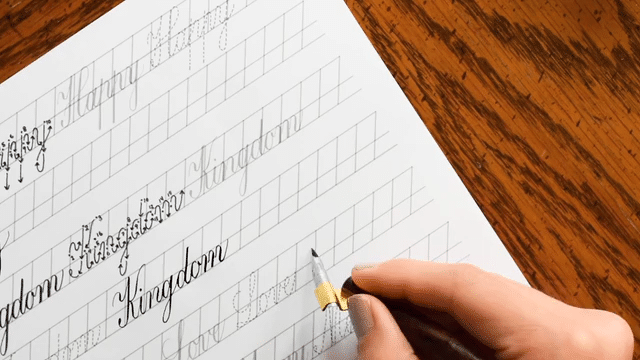
(The calligraphy + guidelines actually took me 13 minutes to write; the video above is a time lapse.)
2. Gather Your Materials
You’ll only need a couple of supplies to create ink spatters. They include:
The piece of calligraphy/paper you wish to spatter
The ink you wish to use to spatter (thin ink works best)
A straight pen, fitted with a flexible used pointed pen nib
A piece of cardstock, a business card, or an old credit card
3. Start Making Ink Spatters!
Now, dip your nib in ink, then position your nib and your card stock about 1.5″ (~4 cm) above the paper you want to make the spatters on. Then, flick the nib against the edge of the card stock. The result will be an organic spray of ink that adds a special something to your work!
Here’s a video that shows you exactly how to do it:
Tips and Tricks
You can use any pointed pen nib to make ink spatters, but I find that flexible nibs (and the Brause Rose nib in particular) work best. That’s because the nib’s tines are nice and pliable, so they quickly spring to action when flicked against the card stock. If you have a nib that’s past its prime, use it! Nibs that are no longer suitable for creating calligraphy work great for this technique.
Ink spatters look good with any calligraphy style, but I like them best with Kaitlin Style calligraphy. The spatters help to enhance the Kaitlin’s casual, elegant nature.
Note, too, that the more watery your ink is, the more success you’ll have in making spatters. If you’re working with a particularly thick ink (like Bleed Proof White), you may need to water it down before you use it to make ink spatters. Finally, remember that when it comes to spatters, less is more. A few well-placed spatters here and there are much more visually effective than a piece that’s covered in ink droplets. If you put too many spatters on your piece, the spatters will detract from the lettering.
Less is more when it comes to spatters. With that in mind, I focused my spatters on three parts of this 8″x10″ calligraphy passage: the upper left, the middle right, and the lower left.
Pairing Big Ink Spatters with Small Ink Spatters
For some pieces, you might want large ink spatters mixed in with a few smaller spatters. If that’s the case, I recommend using a paintbrush to create a few sparse groups of imperfect circles around your calligraphy. Then, while those circles dry, use the nib flick method outlined in this tutorial to make little spatters near the vicinity of the circles.
Yes! You can use gold watercolor (or any color of watercolor, for that matter) to make spatters. Just brush the watercolor on the back of your nib — as shown in this tutorial — and start flicking.
I hope you enjoyed this tutorial and that it helps you create chic and intentional ink spatters for your future projects! If you believe that no ink spatter is a good ink spatter, don’t worry—TPK’s 5 Ways to Correct Art & Calligraphy Mistakes article has you covered. Thank you for reading, and happy creating!
To provide the best experiences, we use technologies like cookies to store and/or access device information. Consenting to these technologies will allow us to process data such as browsing behavior or unique IDs on this site. Not consenting or withdrawing consent, may adversely affect certain features and functions.
Functional
Always active
The technical storage or access is strictly necessary for the legitimate purpose of enabling the use of a specific service explicitly requested by the subscriber or user, or for the sole purpose of carrying out the transmission of a communication over an electronic communications network.
Preferences
The technical storage or access is necessary for the legitimate purpose of storing preferences that are not requested by the subscriber or user.
Statistics
The technical storage or access that is used exclusively for statistical purposes.The technical storage or access that is used exclusively for anonymous statistical purposes. Without a subpoena, voluntary compliance on the part of your Internet Service Provider, or additional records from a third party, information stored or retrieved for this purpose alone cannot usually be used to identify you.
Marketing
The technical storage or access is required to create user profiles to send advertising, or to track the user on a website or across several websites for similar marketing purposes.
TPK’s innovative newsletters are an artistic treat. Join the 125K+ subscribers who have already discovered The Postman’s Knock, and receive 10% off your first Digital Catalog order.
Unlock Exclusive Perks with Premium Plus
Fuel your inspiration and creativity with TPK Premium Plus! Members enjoy three free worksheets or learning resources every month, unlimited video course access, member-exclusive tutorials, and a 10% discount on all Supplies Shop orders.